New Application Structure of Kentico 8
Multiple usability issues in previous versions of Kentico were related to the platform’s over-complex application structure and rather cumbersome navigation. Find out how we changed the information architecture and said farewell to our Site Manager. Early UI prototypes included.
Previously on the Kentico 8 redesign
Last time, I wrote about how Kentico built a team dedicated to UX and how we compiled a list of issues that users have with the product. I also mentioned the design process we used to solve those problems. Today, I am going to show you some of the results.
What to change first
When we got the list of UX issues and were trying to figure out what to do with them, it became obvious that multiple issues stemmed from the same cause; the platform’s over-complex application structure and rather cumbersome navigation.
Let's have a look at the issues again.
The highest priority is Performance, made up of actual system speed and “too many clicks to get anywhere”, which was connected to the second most important issue; the Complicated UI. That is where we put our focus.
The user interface was full of controls and toolbars, presenting too many options, of which the user actually needed only a fraction at a time. The less tech-savvy users had a hard time finding where to click while the more experienced spent a good amount of time waiting for each of too many steps to finish loading before they could proceed any further.
Where is my Site Manager?
Developers who were using the Site Manager had an even more difficult time with navigation. Every single one we had a chance to observe at work had both the CMS Desk and Site Manager open at once. They had to do this, because each controlled only half of the whole system. For these users, performance and navigation issues were doubled. So the first decision was easy. We would merge the CMS Desk and Site Manager into a single system, called Administration.
The merging would reduce overall complexity of the system, but it was just the first step. Now we needed to reduce time and number of clicks it took to get from one part of the system to another.
A general rule of thumb is that for eighty percent of the time, user needs to use only twenty percent of the system. When completing daily tasks, our typical user actually needs to access just a small part of the full system, but the problem was that the structure of the system was too deep. When a user wanted to write a newsletter, they had to switch to the Tools tab, wait for it to load, and then click Newsletters. When they wanted to check something in the store, they had to switch to the E-commerce tab, wait for it to load, and then click Products. Then they had to go to different tab, wait for that to load… You get the idea.
Applications everywhere
The conclusions from our findings were that users need:
A. A place, where they can easily access the parts of the system they use most often; their favorite 20%
B. To be able to quickly navigate to any part of the system from wherever they currently are
That sounds familiar, doesn’t it? All operating systems allow users to do both A and B; especially mobile OS’s which have a simple structure and easy navigation. They are all composed of applications, which users can organize and access however they want. On top of that, the majority of our users own a smartphone and are closely familiar with such a system. Therefore we decided to adopt it as well.
We took all the UIs in the system and looked at them as individual applications. There were suddenly a large number of them, but at the same time the application structure became nicely flat. For example, to access CSS Styles, you no longer had to go to Site Manager / Development / CSS Styles; you could access the CSS Style application directly.
Now we had a pile of about a hundred applications that needed to be organized in a way that would allow users to create a space for their most used (or important) applications and at the same time allow them to access any application from anywhere in the system.
Application Dashboard
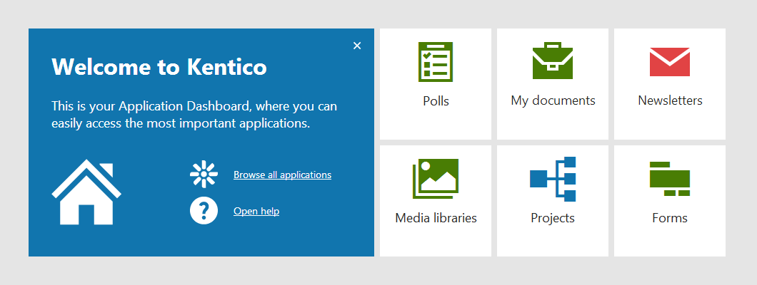
And thus we created the Application Dashboard. It is a homepage of sorts. Users get there after signing into the system and can easily return there from anywhere in the system. This dashboard contains applications that are most important for the user, so they always have them to hand. It can be pre-configured by the administrator, which helps learnability, so new users can arrive at the home page where they just have the most important apps and don’t have to learn where everything is.
We were inspired by Windows 8 and wanted to make this dashboard something more than just a list of favorite applications. We wanted it to be personal; to allow users to customize it. We wanted it to be helpful; to display information beneficial to each user, so they could see important data directly on the tiles of their selected apps.
Not all of these features were implemented in Kentico 8, but I believe we have the most important parts done and the rest will come in next versions.

Application List
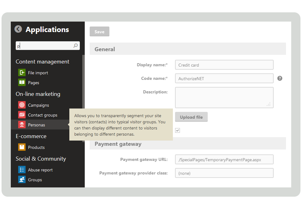
To help users navigate between the applications, we created the Application List. It is a menu located in the system’s header, so it is accessible from anywhere. This menu contains a list of all the applications that a particular user has permissions for. The applications are organized in groups according to their usage and the user can easily search through them to quickly find and open the required application.

The prototypes
I know this post is long, so if you made it here, help yourself to several early prototypes of the Application Dashboard, Application List and various other parts of the system. The prototypes are mostly PDF files and some of them are interactive (active controls are marked in red). You can download them here:
-
The very first vision for version 8
-
Minimal product for version 8, without the Application Dashboard, but with new context help
-
A later prototype with several more applications and new features
-
An HTML Prototype with all the features and several applications, demoed at Kentico Connection London
-
The Final HTML Prototype which contains only the features that would be possible to implement in time for version 8.