Introduction to Kentico 8 Redesign
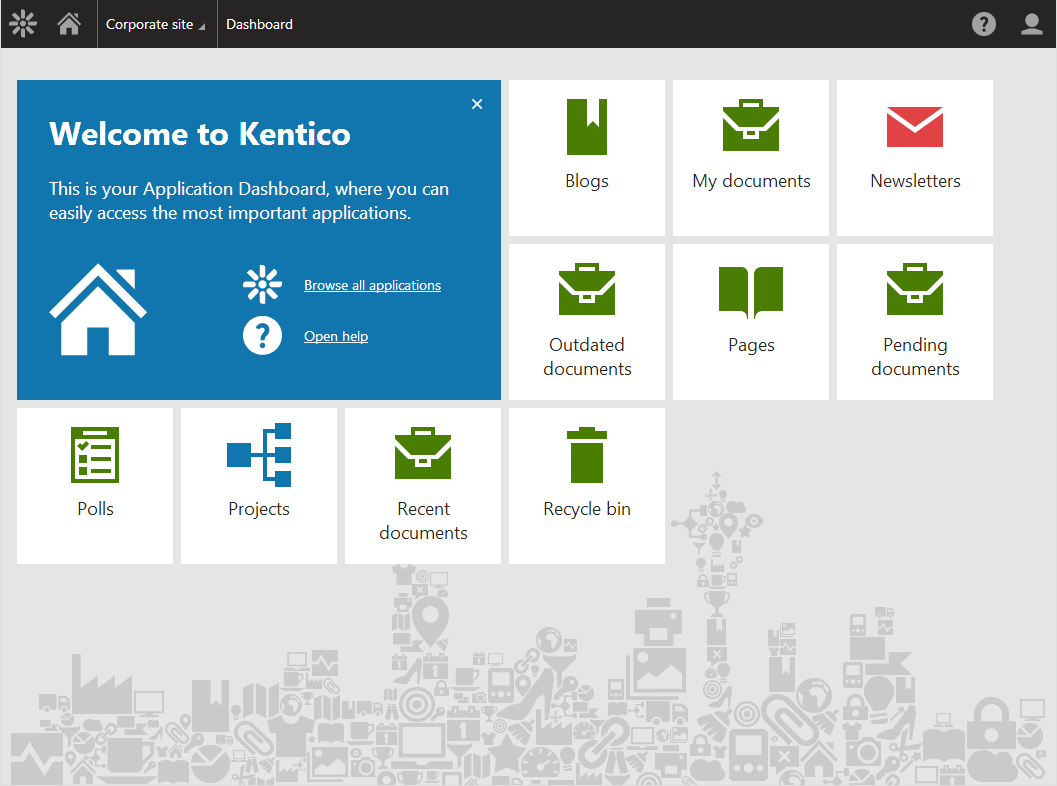
Kentico underwent a major redesign of its user interface. This blog post is the first in a series explaining why we decided to devote three months of development time solely to user experience improvements, how we designed the new version and our results.

Why the redesign?
Although our partners liked using Kentico, we could see it was not perfect. The years of adding feature after feature made the system difficult to navigate through and the user interface was no longer as intuitive as it could be. It was also getting a bit slow. So the decision was made that Kentico will focus on User Experience.
UX @ Kentico
A strong User Experience team of six specialists was assembled and immediately started doing stuff that a UX team does. We started visiting our partners, doing interviews, observations and usability testing. We defined user personas; fictional users with characteristics derived from our research that help everybody imagine the real person requiring and using the functionalities. And we started supporting development – creating and testing wireframes and prototypes of new features.
The big change came in summer 2013, when it was decided that version 8 would be pushed to March and there would be three months of development time devoted entirely to the UI redesign.
UX Issues
Three months for redesign was great news, but it was obvious that it still wouldn’t be enough to redesign everything. Therefore we decided to identify the main user experience issues in Kentico and work out how to fix them. We had quite a lot of material from our user interviews, usability testing and field observations, so we compiled a list and sorted it by priority.
This is what we got:
1. Performance
The performance issues were of two kinds; the overall system response times, which could be slow, and “task performance”, i.e. how many steps certain actions required. Also, the lack of loaders and progress bars often left users wondering whether the system was working or not. This issue was #1 because it was mentioned most often.
2. Complicated UI
The user interface was full of controls and various toolbars, presenting too many options, of which the user actually needed only a fraction at a time. This had a large negative impact on less tech-savvy users who were literally scared of the UI, afraid that they would make a mistake and cause a disaster. We also witnessed many cases of a kind of “banner blindness”, where users could not see important controls, because there were too many of them on the screen
3. Learning and documentation
Learning the system proved difficult for non-technical users, partly because of the complicated UI, but also because users couldn’t find the documentation. Most of them never noticed the small question marks for context help. And when users did find the documentation, they had a hard time understanding it, for it was written rather like a reference guide and would not help with simple “how to” questions.
4. Complicated controls
Many controls, like the CK editor, the scheduler, etc., were difficult to use, or behaved differently from how users expected. (I’m looking at you, Context Menu.)
5. Platform habits
The whole system did not behave as other web applications; the Back and Forward buttons did not work properly, users could not easily work with Kentico in multiple browser tabs, etc.
6. Look and feel
As we were told quite a few times, the environment looked outdated and inconsistent; there were lots of different alignments used in tables, each module looked slightly different, and so on. The visuals simply did not help the user interface.
7. Details and inconsistencies
The application was full of very small issues and inconsistencies that, when combined, certainly did not make users’ lives any easier.
8. Upgrades and hotfixing
Because of a not very clearly defined API, upgrades could be very expensive and as such were not really something that partners looked forward to.
Design process
One of the methods we used for dealing with the above issues was a design workshop organized twice a week. During these workshops we put together groups, each of a few people with various specializations, e.g. a designer, a programmer, a marketer, etc., and gave them about twenty minutes to sketch a simple prototype of the solution.
When done, each group presented their solution to the others. This allowed each group to see the very different approaches of other groups and to point out possible issues. We’d then always repeat the process, so each group could implement the feedback and new ideas of others.
At the end, everybody voted on the most interesting features and UX tried to compile all the results into a wireframe prototype to test inside and outside the company.
As well as our workshops, we also looked at our competition and researched the trends in software design.
Once we had wireframes of the most important parts of Kentico, we held a webinar with selected partners to present early prototypes and verify that we were on the right track. We also did this at Kentico Connection, building more and more refined prototypes based in the latest feedback.
Find out more about Kentico redesign
This article is part of a series explaining how and why we redesigned the user interface in Kentico 8. Check out the rest of the articles from this series:
-
Introduction to Kentico 8 Redesign
-
New Application Structure
-
Navigation
-
Contextual help
-
Behind new look and feel
-
Graphic principles of new UI
-
Design system and evaluation process of new UI
-
Updating iconography
-
Execution timeline