Navigation in Kentico 8
Easy-to-use Dashboard, super-fast Application List, brand new header and smart tabs not only make navigating around Kentico 8 a much smoother experience, but also increase the screen space available for actual content by 20%.
Previously on the Kentico 8 redesign
Last time, I wrote about how we decided to change the structure of Kentico by merging CMS Desk and Site Manager into one, single application, and about flattening the information architecture. I also talked about how we came to the conclusion that a major change in the navigation was necessary and how it was inspired by the approach of smartphone operating systems. Today, I am going to show you how the visions of the Application Dashboard and the Application List turned out in the actual Kentico 8.
The users’ home
After logging into Kentico 8 you arrive at the Application Dashboard. It is a place where users can gain easy access to applications that are most important to them. Users can return to the dashboard anytime by clicking the “house” icon in the application header, or by pressing the F4 key.
The applications shown on the Dashboard are selected by the Administrator and are defined for each user role. Preparing a Dashboard beforehand should help new users in learning the system because they will have all the important stuff available in one place, and will not have to learn the structure of the whole system. For example, the Dashboard for a content editor might look like this:
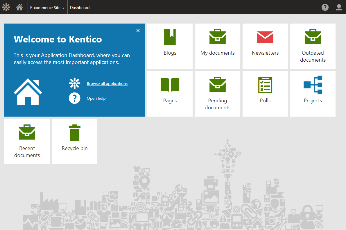
As you can see, there is a big, blue Welcome tile, which is automatically displayed to all new users. It tells them where they are, how to access the rest of the applications and how to get more help. When it is not needed anymore, it can be easily dismissed.
Apart from the Welcome tile, there are ten applications selected as most important for this user role. You can put as many apps on the Dashboard as you want, but less is more in this case. About ten applications should be enough for most roles.
The application tiles are color-coded according to the category they belong to; e.g. Content Management is green, Online Marketing is red, etc. This should help users to quickly tell the tiles apart.
But how can users access the applications not on the Dashboard?
Application List
Kentico 8 replaced the old ribbon navigation toolbar with the much faster and easier-to-use Application List. It is a menu opened by clicking the Kentico icon in the top left corner of the header, or by pressing the F2 key. Since it is part of the Header, the App List is accessible from anywhere in the system.
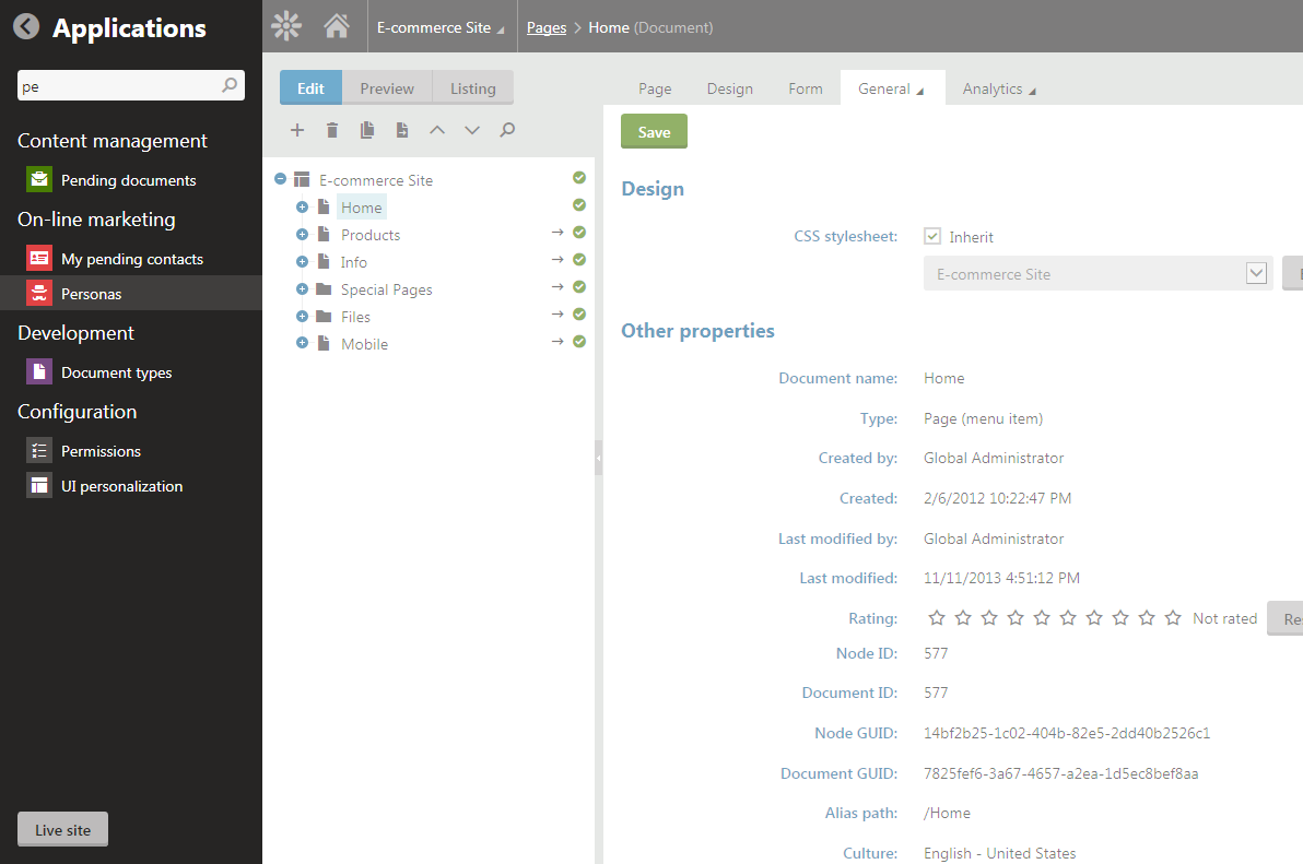
This menu contains all the applications the user has access to, organized into the following categories:
-
Content management
-
Online marketing
-
E-commerce
-
Social & Community
-
Development
-
Configuration
There can be quite a lot of applications, so we added a search field to the top of the App List, which allows users to quickly find the application they are looking for. The search bar opens when you enter the menu, so the user can start typing right away. What’s more, they can move through search results using the arrow keys and just hit the Enter key to go to the selected application. This means you can navigate through Kentico 8 without lifting your hands off the keyboard. Hit F2, start typing, select the application with the arrow keys and confirm by pressing Enter.
Each application has a unique URL now, so users can open more apps in new browser tabs and multitask. It is also possible to bookmark each app so that users can open it directly without having to use any navigation whatsoever.
The Header
The only toolbar that is always present on the screen is the new header. This is how it looks:

Let’s go through it from left to right;
-
The Kentico logo opens the Application List.
-
The “house” takes the user back to their Dashboard.
-
The Site selector allows the user to switch between available sites.
-
The Breadcrumbs display the current position in Kentico. The last node shows the type of object that is currently open.
-
The Speech bubble displays the new Support Chat toolbar.
-
The Question mark displays the new Contextual Help toolbar.
-
The user icon opens the user menu.
I will talk about the new Contextual Help next week, so let’s move on to the last part of today’s post.
Tabs, tabs, tabs
Last, but not least, I want to introduce the reworked tabs system in Kentico 8. The tabs on previous versions took up a rather large part of the screen estate, leaving less space for the content itself and making the user interface seem cluttered. To overcome this issue we have implemented the following tabs systems.
Vertical tabs
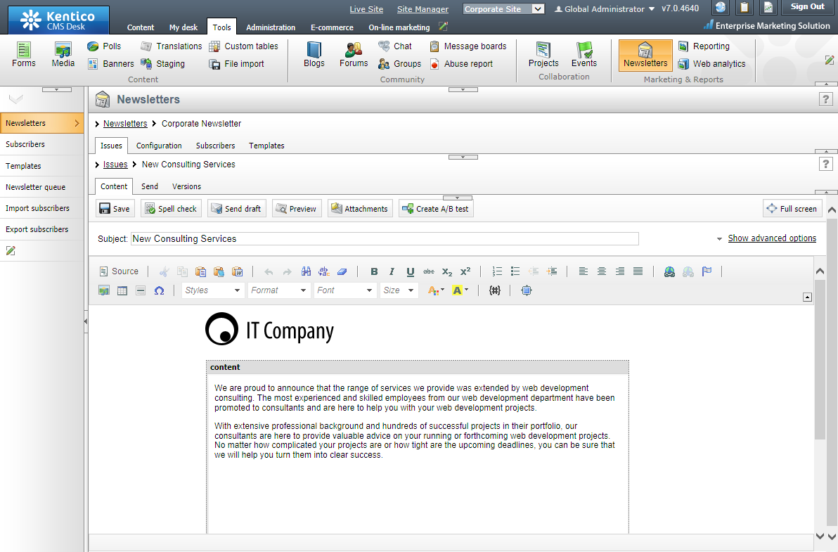
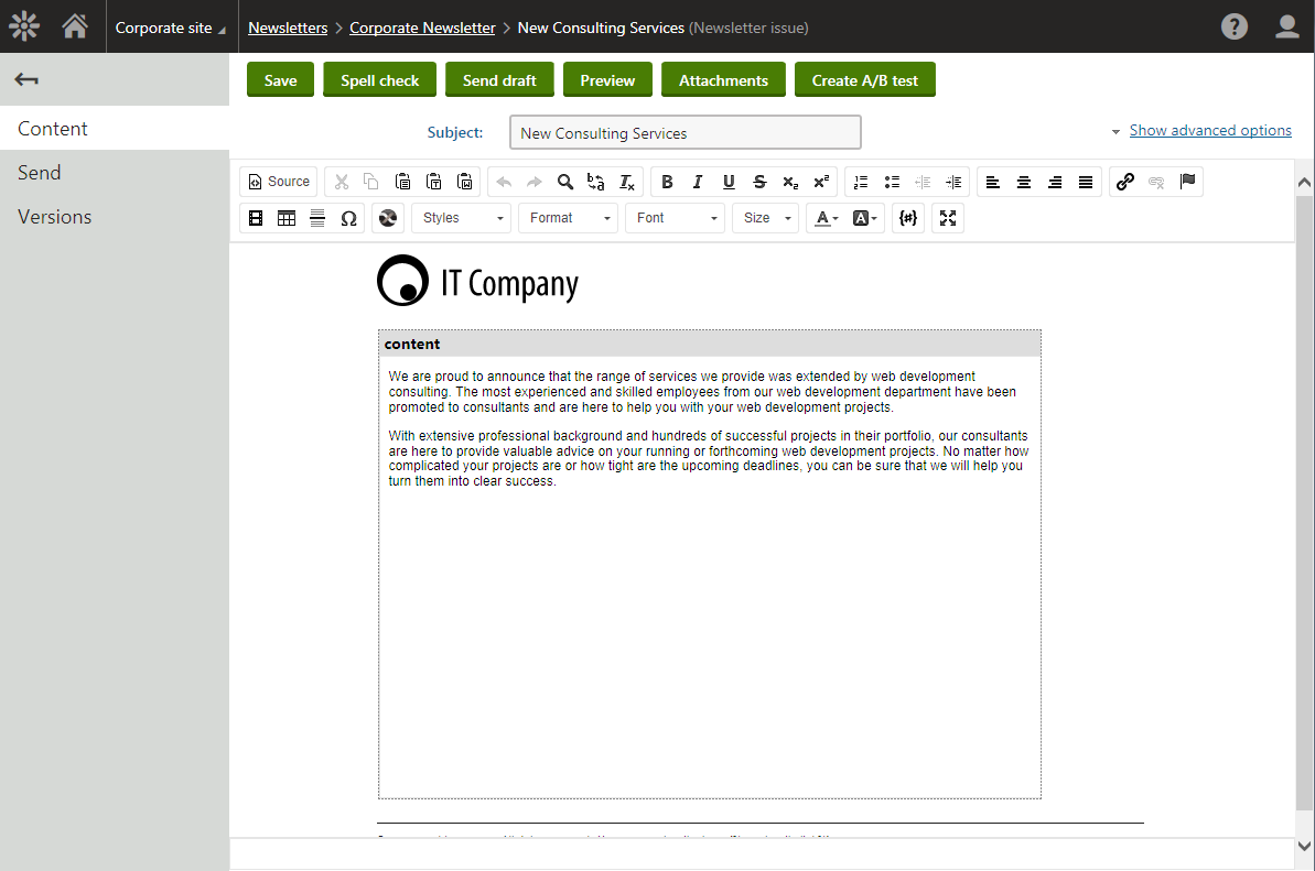
Though a form of vertical tabs were present in previous versions, the vertical tabs in Kentico 8 have vastly improved. The main difference is that only the current level of navigation is displayed and to return to the previous level, users can use the tabs’ back button or Breadcrumbs in the Header. This saves about 20% of real screen space, but the main benefit is a much cleaner and simpler UI. See for yourselves!
Below is the newsletter editing in Kentico CMS 7; note the four layers of tabs in total on this single screen.
And here is the same screen in Kentico 8.
Multilevel vertical tabs
There are places in Kentico where a tab does not have its own page. Instead it’s just another level of tabs. If this is the case, we have multilevel vertical tabs.
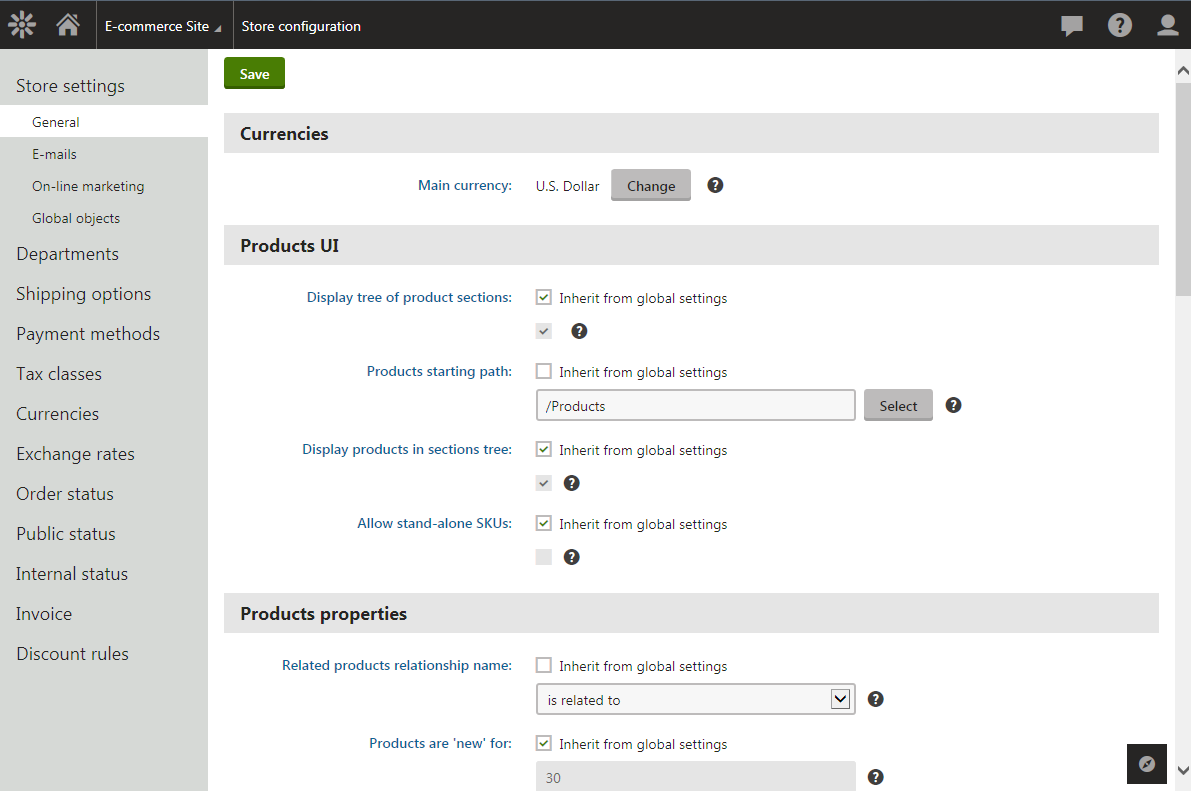
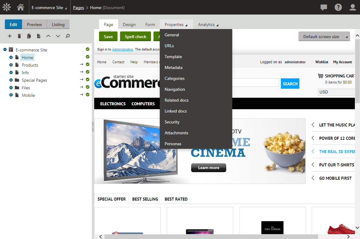
The vertical tabs replaced most of the horizontal tabs in Kentico 8, except in places where the tabs are “inside” a tree, like in the Pages app. The reason why is because having a tree and the vertical tabs all together would take up too much screen space. However, for certain cases where there is a tree and multiple levels of tabs, we had to implement drop-down horizontal tabs.
Drop-down horizontal tabs
Moving the second level of horizontal tabs to a drop-down menu saves a lot of space. It can be seen, for example, in the Pages app.
Minimizing vertical tabs
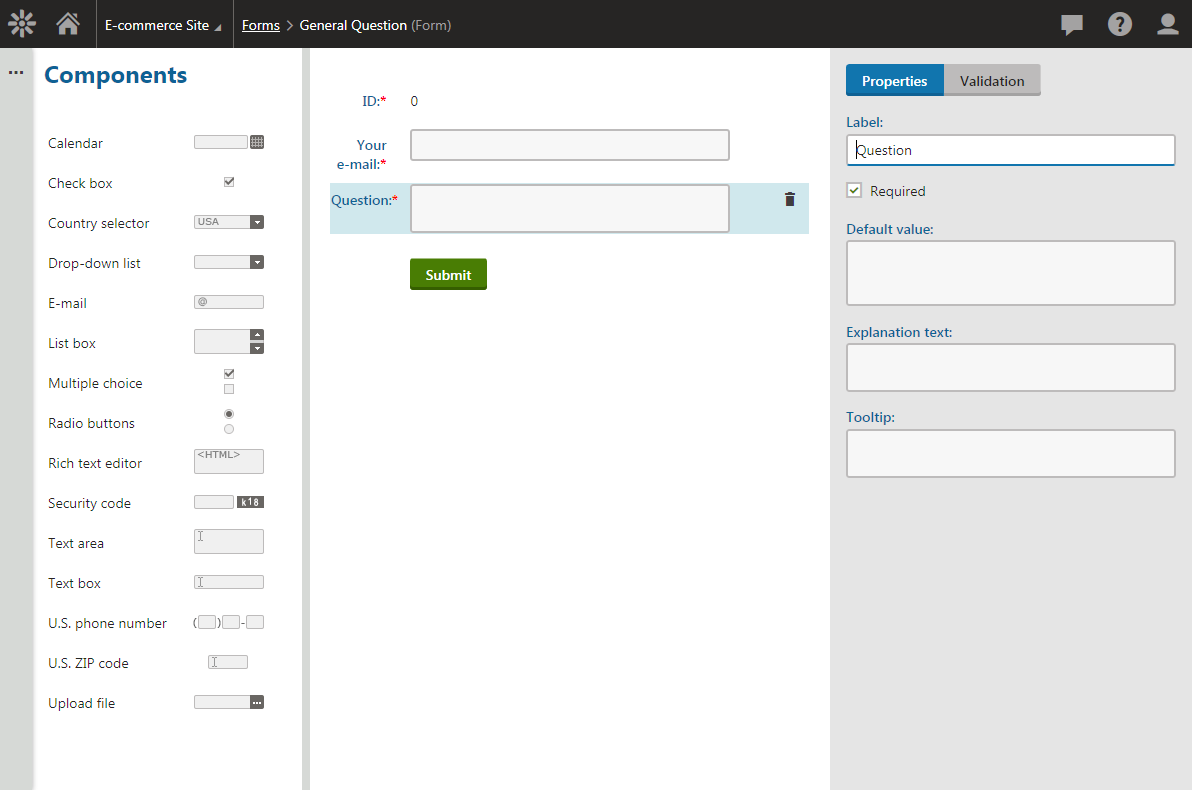
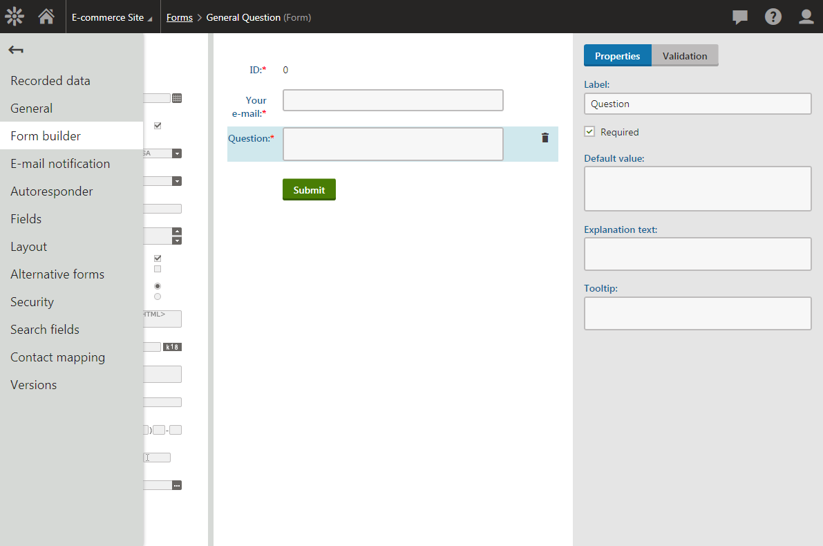
In some cases, a vertical tab might contain a tree or other large control. To minimize the taken screen space we have added minimizing vertical tabs. When you navigate to a tab that contains, for example, Form Builder, the vertical tabs automatically minimize to a column with “…” at the side of the screen.
To display the vertical tabs again, just hover over or click the minimized tabs, like this:
Find out more about Kentico redesign
This article is part of a series explaining how and why we redesigned the user interface in Kentico 8. Check out the rest of the articles from this series:
-
Introduction to Kentico 8 Redesign
-
New Application Structure
-
Navigation
-
Contextual help
-
Behind new look and feel
-
Graphic principles of new UI
-
Design system and evaluation process of new UI
-
Updating iconography
-
Execution timeline