|
|

Web part management |

|

|

|

|
|
Web part management |
|
|

|
|
|
|
Web part management |
|
|
|
|
|
Web part management |
|
|
|
|
|
|
||
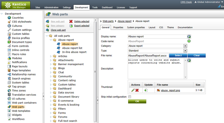
Web parts can be managed in Site Manager -> Development -> Web parts. Here you can see all available web parts organized into categories in a tree structure.
Each web part can be configured through the following properties on the General tab:
•Display name - name of the web part displayed to users in the administration interface (e.g. in the web part toolbar or selection dialog).
•Code name - this name serves as a unique identifier for the web part.
•Category - here you can choose the category of the web part catalog where the web part will be placed.
•Type - sets the type of the web part, which affects its behavior and properties. Different web part types are also marked with different colors and icons on the Design tab of CMS Desk. The following web part types are available:
•Standard - typical web parts displaying some content.
•Data source - do not display any content, only provide data to be displayed by another connected web part. More information related to data sources is available in the Data source web parts sub‑chapter.
•Filter - can be connected to a data source and enables users to limit the range of the data provided by it.
•Placeholder - used for the General -> Layout -> Page placeholder web part, which specifies an area where the content of sub-pages should be displayed.
•Invisible - are not displayed on the page at all and usually perform some type of background task.
•Basic - basic web parts without partial caching and AJAX UpdatePanel support.
•Layout - these web parts can be used to generate a specific layout for page content by defining additional web part zones. For more information, please see the Layout web parts sub‑chapter.
•Widget only - these web parts are only intended to serve as base templates for widgets and are not available in the web part selection dialog on the Design tab of CMS Desk. Please keep in mind that changing a web part that is already on some page template to this type will not remove it or prevent it from functioning.
•Wireframe - special type of web parts used when defining wireframe schematics for pages. They are only for internal purposes and are not displayed on the live site. Wireframes can be created for pages on the Wireframe tab in the Edit mode of CMS Desk, either for dedicated wireframe documents or other document types that contain a wireframe definition.
•File name - contains a relative path to the user control that implements the web part. The path starts from the ~/CMSWebParts/ folder. It is recommended to organize web part source files on the file system in a way that matches the web part category structure. Example: Search/cmscompletesearchdialog.ascx
•Description - a text description of the web part that will be displayed in the selection catalog and as a tooltip in the web part toolbar.
•Thumbnail - used to upload an image that will represent the web part in the selection catalog and web part toolbar.
•Skip initial configuration - if checked, new instances of this web part will be placed directly onto the page without opening the property configuration dialog. This can be convenient, particularly in the case of web parts that are typically used with their default property values.
Since web parts often need to provide a wide range of functionality in order to cover different possible scenarios or preferences, their behavior can be configured through properties. A web part's properties are defined on the Properties tab and handled in the code of its source file.
The values of these properties can then be set for individual web part instances through the Web part properties dialog, which is displayed when a web part is added to a page or configured in CMS Desk. The user interface of each visible property is based on an object called a form control. This allows you to select from a large variety of built‑in web part property types and provides almost unlimited customization options. Please see the Development -> Form controls chapter to learn more.
All standard web parts have the following default properties. These properties are loaded automatically when the web part is defined and their default values can be specified on the System properties tab. If you wish to modify more than the default value of one of these properties, such as its behavior and settings (e.g. for it not to be displayed in the web part configuration dialog) you can do so by overriding it on the Properties tab and configuring it differently.
Default
•Web part control ID - serves as an identifier for the web part. This ID must be unique within the context of each page template. The value of this property may only contain alphanumeric characters and the underscore character ( _ ). It is recommended to keep the ID short to minimize the total size of the page’s output code.
•Web part title - title of the web part displayed on the Design tab of CMS Desk and in On-site editing mode. If empty, the value of the Web part control ID property is used for this purpose.
Visibility
•Visible - indicates if the web part should be displayed.
•Hide on subpages - indicates if the web part should be hidden on sub-pages. If checked, the web part will not be displayed on documents that inherit the web part from a parent document.
•Show for document types - contains a list of document types on which the web part should be displayed. If the currently selected document uses the page template containing the web part, but its type is not specified by this property, the web part will be hidden. The document types in the list must be specified by their code names and separated by semicolons (;). If empty, the web part will be displayed on all document types.
•Display to roles - contains a list of roles to which the web part should be displayed. This may be used to implement documents with specific functionality for different types of users. The roles in the list must be specified by their code names and separated by semicolons (;). If empty, the web part will be displayed to all users.
Web part container
•Web part container - specifies the name of the Web part container (box) to be displayed around the web part. Only the containers defined in Site Manager -> Development -> Web part containers can be used. The currently selected container can be edited directly by using the Edit button.
•Container title - sets a title for the container. This title is displayed only if the {%ContainerTitle%} macro is used in the code of the container.
•Container CSS class - CSS class used for the web part's container. Applied only if the {%ContainerCSSClass%} macro is used as the value of a Class attribute somewhere in the code of the container.
•Container custom content - may be used to pass a text parameter to the specified web part container. Applied only if the {%ContainerCustomContent%} macro is used in the code of the container.
•Hide container on subpages - if enabled, the container will not be displayed around the web part on child documents that inherit it through visual inheritance. For example, this allows you to add a container for a master page only.
HTML Envelope
•Content before - HTML content placed before the web part. Can be used to display a header or add some encapsulating code, such as <div> or <table> elements to achieve the required layout.
•Content after - HTML content placed after the web part. Can be used to display a footer or close the tags contained in the ContentBefore value, such as </div> or </table> elements.
The structure of a web part, its content before/after sections and container is as follows:
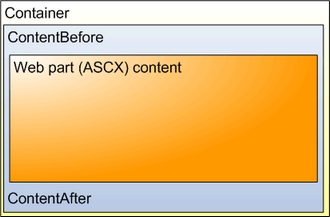
Containers, unlike the ContentBefore and ContentAfter sections, are re-usable for other web part instances and may contain dynamically inserted values of web part properties.
AJAX
•Use update panel - indicates if an AJAX UpdatePanel container should be used for the web part. More information can be found in the AJAX support topic.
Time zones
•Time zone - specifies the type of time zone used for the content of the web part. The following types are available:
•Inherit - inherits the time zone settings from the Page placeholder web part used to display the page template containing this web part (typically the one on the master page).
•Server - server time zone settings will be used by the web part.
•Web site - website time zone settings will be used by the web part.
•User - time zone settings of individual users will be used by the web part.
•Custom - some other time zone will be used based on the selection done in the Custom time zone property.
•Custom time zone - may be used to assign a custom time zone specifically for the content of this web part. If selected, the time zone will be used regardless of current user or website time zone settings.
Performance
•Disable view state - indicates if view state should be disabled for the web part.
•Disable macros - if checked, macros contained in the values of the web part's properties will no longer be resolved.
•Partial cache minutes - sets the number of minutes for which the output HTML code of the web part should remain cached. This process is similar to full‑page caching, but only for the code of the web part specifically. If left empty or set to 0, partial caching will be not be used for the web part.
•Partial cache dependencies - contains a list of cache keys on which the partial cache of the web part depends. When the specified cache items change, the partial cache of the web part is deleted. Each line may only contain a single item. If the Use default cache dependencies box is checked, the default dependencies will be used, which include all possible object changes that could affect the specific web part.
Output filter
•Filter output HTML of web part - if checked, the output code generated by the web part is processed by the output filters enabled through the properties below.
•Resolve URLs - indicates if the output filter should remove the "~" character in relative URLs and replace it with the root URL of the website (including the application's virtual directory if applicable).
•Fix attributes - if checked, the filter ensures that all attributes of HTML tags are in valid XHTML format.
•Fix Javascript - if checked, the filter ensures that the type and language attributes are included in all <script> tags.
•Fix lower case - if checked, the filter ensures that all HTML tags and attributes are generated in lower case.
•Fix self closing tags - if checked, the filter ensures that all HTML elements without closing tags are properly closed, e.g. <br> will be replaced by <br />.
•Fix tags - if checked, the filter replaces tags that are not XHTML valid with appropriate equivalents (<strong> instead of <b>, <em> instead of <i>).
•Fix HTML5 - if checked, the filter replaces attributes that are obsolete in HTML5 with CSS classes named in format <attribute name>_<attribute value>. These classes need to be defined in the CSS stylesheet used by the page or specific web part. The affected attributes are: cellpadding, cellspacing, width, height, border, align, valign
•Convert TABLE tags to DIV tags - if enabled, <table> elements and their child <tr> and <td> tags are automatically converted to <div> elements with CSS classes assigned, named according to the replaced tag. These classes need to be defined in the CSS stylesheet used by the page or specific web part.
Layouts allow you to customize the appearance of a web part or add further content into it. You may create or edit a web part's layouts on its Layouts tab. Designers can choose which layout they wish to use for each specific instance of the web part. More information and an example can be found in the Modifying web parts -> Customizing web part layout topic.
You can define any CSS classes needed to correctly display a web part by editing it in on the CSS tab. If the styles require any files (such as images), you can add them on the Theme tab. This stylesheet will then be automatically requested on all pages where the given web part is placed (in addition to the website or page‑specific stylesheet). For more information about page component CSS styles, please see the Development -> CSS stylesheets and design -> CSS for page components topic.
If you need to ensure that a certain CSS class is applied to the content of a web part, there are several options. You can simply use a container or the Content before / after properties to enclose the web part into a HTML element containing the appropriate class. Alternatively, you may define a new property for any web part using the Column name CssClass and Attribute type Text. Entering the name of a CSS class from your stylesheet as this property's value will automatically wrap the given web part instance into a <Div> element applying the specified class.
You can add your own documentation to a web part on the Documentation tab. If you wish to document specific properties, you need to fill in the Field description on the Properties tab.
To generate full web part documentation in a printable format, enter <website URL>/CMSPages/Dialogs/documentation.aspx?allwebparts=true into your browser. It is recommended to use FireFox for correct formatting and page breaking.