Kentico 8 Technology – Design System
You’ve already seen many tweets and posts about the new fancy
Kentico 8. Among other features, it brings a new admin experience through the updated user interface, which has been completely redesigned and is light and fresh. From a
web development point of view, it was really tough to make it consistent, but at the same time, it was definitely full of web development excitement. Working without a system in place would get us into huge trouble. With this in mind, I'd like to briefly describe
what concepts, tools and blocks we used so that you have an overview of "what´s inside". This will give you a better starting point for your customizations and module development.

CSS beautified by LESS
First, let’s have a look at the most essential thing for web developers – CSS and stuff that’s related to it. There are web developers who write their code in hand, and other developers like us that keep track of technologies and use them to build products more effectively. When thinking about the most effective way of redesigning and transforming old CSS styles, we realized that we needed a tool that allows us to create organized, maintainable, yet extensive CSS.
We needed a CSS preprocessor!
CSS Preprocessors are very attractive because they offer things that ordinary CSS don’t. They add features that allow nesting, variables, mixins, server comments and much more. Currently, we can see three main preprocessors:
LESS,
SASS and
Stylus. An important fact is that preprocessors are kind of connected with some CSS frameworks (
Bootstrap is using LESS,
Foundation is rather SASS based), which play a big role when choosing the right one. Finally, we took advantage of the
LESS preprocessor mainly because of its ease of use, huge community, and because of our preference for Bootstrap.
Kentico Bootstrap it is
Building a system as robust as CMS means that you can’t avoid customizations of framework created to be used on ordinary web pages. As a web developer you have a couple of options for Bootstrap customization to make it fit to your particular webpage. One of your options is to create additional LESS files and to not modify the default Bootstrap ones – this way you can customize Bootstrap as updates come. Regrettably, we couldn’t go this route because we had a lot of customizations ahead. We also realized that there are many special controls that go beyond standard Bootstrapped website components. UI components are simply way more complicated and require special treatment. Therefore,
we took the best of Bootstrap elements and features as starters and then customized its files directly for our needs. We can still update some parts if we spot a great bug-fix or improvements in Bootstrap.
LESS compilation
LESS offers huge amount of possibilities but requires one special effort in contrary –
LESS files need to be compiled into a CSS file. Fortunately, it is not a big deal since there are multiple smart tools that do this job for us. Like you (as a
Microsoft based company), we
initially wanted to give a chance to a Visual Studio built in extension called
Web Essentials. This tool, however, turned out to be unreliable when it comes to compilation – it simply doesn’t compile LESS files every time on-save. In the
next iteration, we choose another tool called
WinLess, which is an external tool, but still intuitive, simple, yet powerful. WinLess has proven its qualities with our development teams. It actually works almost automatically - it checks folder changes and compiles selected LESS files into CSS files.
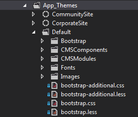
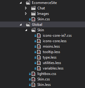
Bootstrap files location on file system
All the Bootstrap LESS and CSS files are located in the
\App_Themes\Default\ folder. There are two main files:
bootstrap.less and
bootstrap-additional.less that import all the LESS files from subfolders (these are actually being compiled into the final CSS). Now, you probably wonder why we have two files for this – the purpose is truly pragmatic – we needed to create two files due to Internet Explorer limitations – it doesn’t support huge number (4095) of selectors in one CSS file.
All of the other files are located under
\Bootstrap folder. Components that are rather specific to Kentico are located in the
\CMSComponents folder, and styles related to a particular module can be found in the
\CMSModules folder.
Custom CSS for UI
Now that you know where to find our UI styles, you might put some
custom styling into a game. Where is the best place to add it? It is going to be a
new LESS/CSS file so that
it is not re-written in further hotfixes/upgrades. With regards to the physical path, we recommend that you use a separate folder for such customizations – e.g.:
\App_Themes\Default\Custom. If you put your LESS files here, don’t forget to map WinLess to this location so that it compiles CSS files automatically for you.
Typical components used in UI
Let’s go ahead and see what else we offer you for smoother and slick module development. In cooperation with our powerful
Portal Engine you can
develop modular and manageable modules pretty easily. Actually,
new UI pages are running on our Portal Engine, and we recommend you to use it for your custom modules.
In order to keep in line with preexisting UI components,
you can use blocks that we’ve already implemented – this is the main concept of Bootstrap that we tend to use in UI. See the list below as a quick overview of reusable blocks – at this time it is worth mentioning that we’ll prepare a complete
Style Guide for you. We used one internally during the
Kentico 8 redesign, but we need to polish it so please be patient –
you can expect it to be released in June or July - regrettably our priorities have been changed so this project has been delayed (no estimates yet). In case you already need a markup use e.g.
Firebug to inspect a particular component directly on the page.
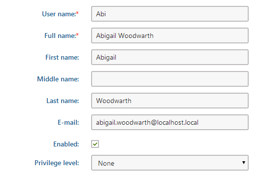
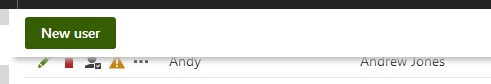
Forms
You can find forms all across the Kentico user interface, as they are essential mains of transferring users input. A good example can be found in the User’s application under the General tab.
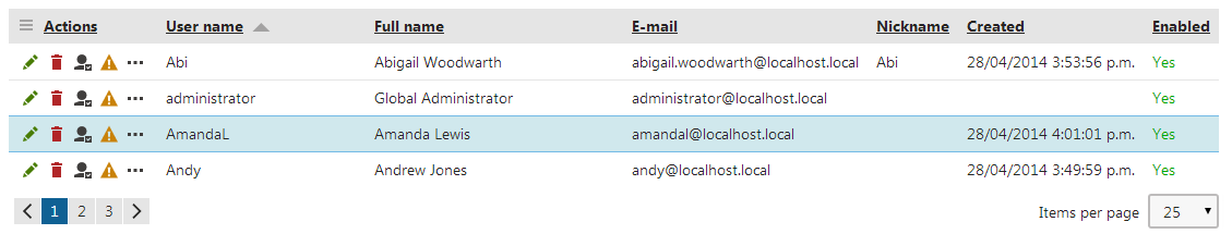
Tables
If I were to choose a second most used component throughout the system, I would choose tables; they list objects of all types. The table contains Action links in the header (if you click the menu icon), and you are usually able to perform a particular action for each item in a row (see table action icons – three dots will show a dropdown). In addition, there is a pagination below each table (well, if It reach selected items per page). The User’s application is a great example of such a table.
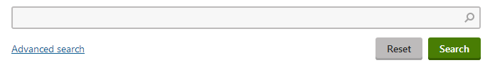
Filters
Speaking about filters – they are mostly connected with tables and are useful when you need to find some particular object listed within a table. They may contain an advanced search link that shows more complex filters. As an example, let’s go to the users listing – it filters users objects in a table:
Buttons and header actions
As you know from front-end web development, buttons are basic elements that are not dedicated to forms, but they are located in multiple places to start an action. In the example below, you can see a button that initiates a new dialog in the Users application. Below is an example of a header action – the bar above the content is fixed to the top to give you access to the buttons even if the page is scrolled down.
Button groups
In some cases it makes sense to group buttons to work as a switch where only one item at a time is switched on. A nice example of this can be found in the Pages application – there is a View modes button group.
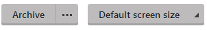
Multiple action buttons
If you switch to any document under workflow and take a look at the Page tab in the Pages application, you’ll spot a multiple action button with dropdown – it has one particular option available that can be clicked directly (Archive in this example). On the other hand, there could be a multiple action button that exhibits behavior similar to a standard dropdown list – you must select a value before submitting a value (Default screen size in this example).
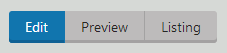
Tabs
Now when we are on the Pages application, you can take a look at the tabs component located at the center of the page. There are even dropdown items on the two items located on the far right-hand side of the bar (see below).

Alerts
There are four type of alerts:
-
green success alerts
-
blue info alerts
-
yellow warning alerts
-
red error alerts
Alerts can be persistent – showing important messages and waiting for some action such as the alerts that are displayed for a brief moment (can be displayed e.g. on Form tab in Pages application). See below:

Styling UI components on live site
There are places where you can spot the above blocks on the lives site – typically those are locations that are meant to serve for site or user administration purposes. In order for you to be able to deal with it better (even without any huge UI CSS), we have created the
Skin.css stylesheet for default styling of web parts on your site. The
Skin.css file helps to display most of the web parts correctly and is ready for use when placed on a page. When developing a site, you will probably need to adjust it according to your site look and feel. Here I’ll briefly describe a way to do that.
The Skin.less file is located in the
\App_Themes\Global\ folder and imports multiple skin sub-files in
\App_Themes\Global\Skin\ folder. More importantly, however, is that the global Skin.css file is imported in the site‘s Skin.css file (this applies to our sample sites). For instance, our Corporate Site sample site has its own Skin.css file in
\App_Themes\CorporateSite\ folder. If you open this file, you'll see that it just imports the global one. Well, there are additional CSS declarations that add specific styles just for this site and leave the global Skin.css file untouched. This is the way we recommend that you use it on your own site.
When developing a site using any pre-defined sample site, keep in mind that the Skin.css file is included in all of our sample sites, but a Blank site and also a newly created site have no Skin.css file. You can copy eight physical files to the App_Themes folder and it will be linked automatically, or link it using a CSS Stylesheet web part.
Custom font-icons
Although
Kentico 8 uses
skeuminimalism design with as low a number of icons and images as possible, by taking a look at its interface, you can quickly spot a bunch of new
monochromatic ones. Therefore, you might find the following few lines describing the way of creating custom font icons to be helpful.
Icons in the UI are not the usual images, but rather font-icons elements. Their usage is described nicely in the following
Updating iconography in Kentico 8 article. Actually, the whole list of their CSS classes can be found in the following file:
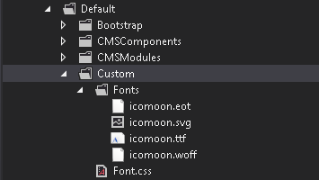
\App_Themes\Default\Bootstrap\icons-core.less, while particular font files are located in the
\App_Themes\Default\Fonts folder.
Extending predefined icons
Generally speaking, you need to
generate your custom font and use the font files as well as the CSS file where you define CSS classes for your icons. More specifically:
-
The Secure and recommended way is to create another font and use a new CSS file that can be created by e.g. the Icomoon application. This way you will be able to apply all of our hotfix patches with no issues.
As for the best place to place them – we recommend the
Custom folder as mentioned above.
Example of custom branding
Now, when you know the theory, you’ll
see an example on how to modify the Kentico logo using your own font-icon (created in Icomoon) and
how to change the color of the navigation bar all across the Kentico UI (using LESS preprocessor in cooperation with WinLess tool).
Logo modification
-
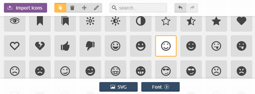
Create a custom logo font-icon. Using Icomoon you can use your custom svg file. In this example, I used the predefined icon library as I did on the image below. Once you select the desired icons, Icomoon allows you to download a whole package, including fonts and CSS.
-
Let’s put font files and CSS file (in Iconmoon package called style.css) to the Custom folder under the Default folder. The CSS stylesheet will be grabbed automatically (asp.net functionality). CSS should refer to font files that are located under the Fonts folder. You can change the generated CSS file as shown below:
[class^="custom-icon-"], [class*=" custom-icon-"] {
  font-family: 'icomoon';
  display: inline-block;
  ...

.custom-icon-smiley:before {
	content: "\e600";
}
-
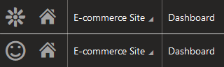
Now you are able to use your custom font-icon contained in your font like this (in \CMSAdminControls\UI\Header.ascx):
<i class="custom-icon-smile cms-nav-icon-large" aria-hidden="true"></i>
Colors modification - using LESS
-
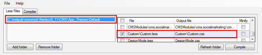
Create a new LESS file in the Custom folder. Then, just update the WinLess path in order to track changes in this file and compile it on-save – if you have selected the Default folder, just make sure your Custom.less file is selected to be compiled.
-
Just a note - you don’t necessarily need to use an LESS file. It is perfectly fine as a CSS. However, with a pure CSS you lose the power that the preprocessor offers.
-
We recommend enwrapping your styles into a .cms-bootstrap class so that the live site components are not affected due to a CSS specificity. The Custom.less file content can be defined in the following way:
cms-bootstrap {
  // navbar bg
  .navbar-inverse,
  .breadcrumb.cms-nav-breadcrumb{
    background-color: #1175AE;
  }
  // site selector
  .header-site-selector .fancy-select {
    border-left: 1px solid #C0E3F6;
    border-right: 1px solid #C0E3F6;
  }
  // icons and text
  .cms-nav-icon-large,
  .cms-nav-icon-medium,
  .header-site-selector .fancy-select .dropdown:after {
    color: #FFFFFF;
  }
}
-
The final result can look like this:

Wrap up
I've shown you the web development part of the new
Kentico 8 UI. Actually, it is based on the Bootstrap framework utilizing LESS preprocessor, which is well-known and gives you the power to easily build either a custom user interface in your own modules, or modify ours with ease. Now you know the files in play and you know where to store yours. You are able to change any system font-icon and use it for your module. I've shown that changing the Kentico logo and some brand colors is a piece of cake.
I believe that
user interface customizations are much easier than before. With all of the information above in mind,
try it on your own and give us your feedback!