How would you like your web part categories?
We want to know how do you feel about current structure of web part categories and what are your thoughts about possible restructurization of them.
Hi there,
We are making some improvements to the Portal engine development in the upcoming version 5.0 and one of them is a new Web part selector for adding the web parts.
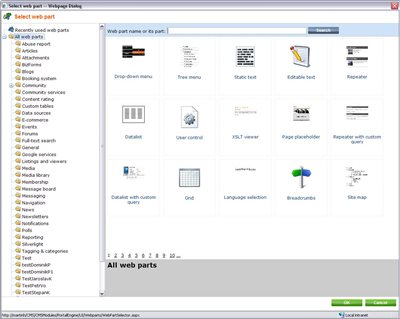
Here is how it looks (the design is not final and please ignore the test categories):

Basically, for now we keep the current web parts structure, which is pretty much divided by the particular modules, and the categories usually do not have subcategories to make it as flat as possible.
Currently there is about 25 main categories with about 20-30 web parts in largest ones. The number of web parts will definitely grow in time so in future it would probably extend to some even larger numbers.
What is new is that there is a search functionality by the name of the web part and you always see all webparts in the category including subcategories, so you may quite easily search also in all web parts, which is very helpful if you search something specific.
What we want to know is how do you feel about current web part categories, if they are clear to you and easily usable for you and even your web designers. From both beginners and experienced user's perspective.
Why?
We are deciding on what our next approach to the web part categorization should be so we are trying to get some feedback from you on whether you like current state and we should keep it or if we can do something more for you and make it somehow more friendly also for beginners who are not so educated about terms of modules and particular web part names. Basically we need to know
what is more friendly and intuitive for you, the current state or the proposed solution.
But it would require some significant changes in the web part categories structure and specifically deeper category tree.
How it might look like in the future if you like it
Here is one version of how it might look like in the future:
WebPartsStructure.doc
NOTE: The order of each of the items would probably be alphabetical, not exactly as in this document.
It basically creates larger hierarchy over the web parts where each category contains no more than 10-20 items and the web parts are divided by the functionality on the main level of categories, not by modules. The modules division are the next level.
In case we introduce more categories, it means following for you:
-
Your first though will be probably what you are inserting in general (e.g. Content / Image / Media / Form / etc.), and then see from which modules it is available as opposed to current state where you know in which module this particular data is located (e.g. Document tree / Media library / Products / BizForms / etc.) so you browse strictly by the module on the first level.
-
With more and deeper categories, you go to the deeper levels of the category tree and see less items of specific kind as opposed to current state where you always see all web parts in specific category and list in them (but you can do similar things with the new one since the selector also displays items from subcategories).
-
For future, the tree with deeper categories won't grow so much in the first level of categories and new web parts will be distributed more into deeper and new subcategories. With current state, both number of items in specific category and the number of main categories will grow as it grows today.
As you can see, both of these solution has pros and cons, so now it is up to you to decide and let us know what you think suits you and your employees better. Please consult it with your developers what would work better for them. I believe especially the beginners can bring great contribution to this discussion since they are most influenced by how intuitive each solution is for them when they start to develop.
The ultimate question is:
Do you like more the current state or the proposed solution?
Please let us know in the comments if you prefer either of the two solutions or propose another one you think might work. The discussion is open for everybody.
I won't tell you my opinion and reasons for it just yet so I do not influence anybody, I will post it to the comments in about a week from now.