Lessons Learned from Developing a Simple Transactional Email
HTML email has been a Wild West of digital marketing for such a long time that you probably agree with me that designing great emails, well, sucks. Still, we built one for our training website using Kentico EMS. What was that like and would we do it again?"
Let's make things clear from the start, I'm not originally a developer who writes tons of code every day, who dreams about elegant scripts or deploying scalable applications to Azure. My background is in education, and in Kentico, I help people make the best use of all our products' features through e-learning courses. And one of my recent challenges was to create an HTML transactional email. Do you want to know what I learned?
Creating a works-in-every-client email template in 2020 is painfully hard. Here are some tips I discovered on the way:
- Get comfortable with HTML 4 techniques (no kidding, you’ll be designing the layout with tables!).
- Prepare for neverending testing. The email clients are changing frequently, and each change can break the user’s experience. (You can test your emails for different email clients using tools like EmailOnAcid or Litmus.)
- If you are starting with HTML emails, why not give a shot to frameworks? Open-source frameworks like MJML or Foundation for Emails produce clean code and help overcome all the obscure HTML email quirks that many email clients still thrive on. And what's even better, they are easy to learn - check out this awesome MJML guide.
- Want to learn more about the topic? Here’s a handful of useful resources to get you started.
So, do you still want to code the email by hand? Read on to see how I, with the help of my team, built a transactional email for our training website. And how Kentico EMS helped us in developing it.
Meet the email that delivers user's credentials
Participants in Kentico business courses use a training website where they can practice what they're learning and discover Kentico features. The training website is created per request and has a limited life-span to 30 days. Within these 30 days, the training website users get several transactional emails - we call them notifications. These notifications request a confirmation to create the training website, contain a link to the website and user credentials or inform the user about the website's upcoming expiration.
Let’s take a look at the first notification, which delivers the user credentials.
Style and content are dead-simple
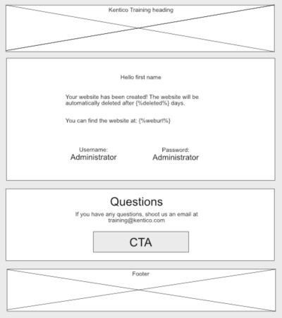
The log-in information is simple but vital content. It's using a minimalistic layout - a thematic header, two blocks with some text - and a footer.

Supports both mobile and desktop
The training participants are website editors and digital marketers who are as often on desktop as they are on mobile. Knowing our recipients led to basic requirements. The notification must:
- Contain a descriptive preheader that identifies its purpose in the inbox.
- Be readable both on desktop and mobile. It needs to support different email clients including several versions of Outlook (2013+), both for Windows and Mac OS.
- Show a simpler layout without the header and side padding on the mobile.
There are multiple approaches to creating HTML email templates that fit the requirements. I picked the responsive design because I like it when HTML stuff works no matter where you open it. The template builds on the Salted template that was tweaked (and popularized) by Litmus's Jason Rodriguez. For more details about other approaches see this article.
Media query makes the table fluid
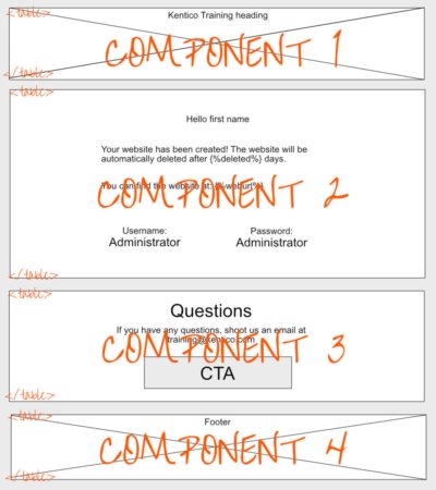
The notification is built from isolated components. Each component is defined as a fluid table and styled both inline and through a media query (for supported clients).

It's 2020 and the dominant clients finally support standard CSS classes in media queries. That's why I decided not to target the classes through attribute selectors, which used to be a must just a few years ago, and went with the plain CSS class selectors. To layout the email correctly in obscure email clients such as desktop Outlook, I used nested tables and inline styles.
<!-- Presentation table -->
<table role="presentation" border="0" cellpadding="0" cellspacing="0" width="100%">
    <tr>
        <td bgcolor="#f5f5f5" align="center" valign="top" style="padding: 0" class="no-padding">
            <!-- Fixed width table (e.g., Outlook) is overriden by .responsive table class in supported clients -->
            <table border="0" cellpadding="0" cellspacing="0" width="640" class="responsive-table">
                <tr>
                    <td bgcolor="#ffffff">
                        <table role="presentation" style="width:100%;max-width: 640px;" border="0"
                            cellspacing="0" cellpadding="0">
                            <tr>
                                <<!--content of the bottom section of the notification -->
                            </tr>
                        </table>
                    </td>
                </tr>
            </table>
        </td>
    </tr>
</table>
Dive into the notification's HTML
Here is the whole notification template with some code comments.
To get the most out of this post, open the code in a new browser window so you can follow along.
Don't miss these hidden gems
- Styles are both in the <head> and inline
- With Gmail, finally, supporting styles in the document's <head> tag, there are only a few clients where this pattern doesn’t work. These clients are supported through inline styles within the template body.
- When Gmail (and some other emails) started supporting styles in the <head>, they also started ignoring some of the inline styles, especially on table-related tags. This is not a downside - you can now use progressive enhancements, and spark up the email experience with some CSS sugar. Check out Gmail’s supported styles and properties in the Google Developers documentation.
- The preheader uses ‌ hack discussed in the previous post on Kentico blog. It creates whitespace after email preheader and helps your email stand out among other emails in the inbox:

- Header image
- The image is served from the media library which allows easy distribution via CDNs. It's referenced using its permanent URL. The tilda sign "~" before the /getmedia resolves automatically into the website's domain or site presentation URL in case of MVC projects.
- The header doesn't display on mobile clients thanks to .mobile-hide CSS class.
- The alt tag that displays when images are blocked is styled with some additional CSS to make the text more appealing. Similarly, the space for the header image doesn’t disappear.

<td style="padding: 0 0 0 0;" class="header" class="mobile-hide">
    <table role="presentation" border="0" cellpadding="0" cellspacing="0" style="width: 100%; max-width: 640px;">
        <tr>
            <td width="100%" align="center" valign="top" class="mobile-hide">
                <table role="presentation" border="0" cellpadding="0" cellspacing="0">
                    <tr>
                        <td align="center" valign="middle" height="220" width="640" bgcolor="#efefef"><a href="https://kentico.com"
                                title="Go to Kentico website" target="_blank">
                                <!--Update the src tag with the Permanent Url of the image in your Kentico instance-->
                                <img src="~/getmedia/4d8ce3c0-5c88-4aa1-879e-e4e52fa14fc1/header-image.jpg" alt=" Kentico Training"
                                    width="640px" height="220px" class="header"
                                    style="display: block;width:100%; max-width: 640px;font-family: sans-serif; color: #001d33; font-weight: bold;  font-style: italic;margin:0;padding:0 0 0 0;border:none; text-align: center;"></a>
                        </td>
                    </tr>
                </table>
            </td>
        </tr>
    </table>
</td>
- @media only screen and (max-width: 640px)
- One media query serves all the devices. Fixed table widths are overridden by the conventional .responsive-table class. Properties of all CSS classes within the media query use the !important directive to override inline styles if the condition is met.
- The notification is 640px wide. Because of the notification’s content, we expect opens that matter mainly on desktops and laptops that have large-enough screens. That's why we went with a bit wider notification even though 600px is still considered the safest width and it's often used in templates.
- Open Sans default font
- As web fonts are getting more and more supported, the notification links the Open Sans web font in the document's head tag through a link and direct import.
- The at-rules ("@") sometimes confuse email clients. For example, Gmail tends to strip the <style> tag if it meets “@” declaration within another “@” declaration. That's why the @imports stay outside the media queries in the notification.
- The @font-face method imports 300, 400 and 700 sizes in the WOFF font format that is widely supported by email clients.
- If any email client doesn't support web fonts, the font falls back to sans-serif.
- The mobile experience overview
- Notification is responsive on mobile clients with small screens.
- Because of the smaller screen factor, the left and right gray borders hide if the device is in portrait mode. If a mobile device is in landscape mode, the notification has the padding.
- The footer font slightly increases in size on mobile.
- The header image is hidden on mobile.
Improve reader's experience with View in browser link and some GDPR sweetness
When it comes to customer satisfaction, it's the details that matter. What else can you add to the email to bring on some "that's a really nice touch" experience?
Disclaimer: Because of how the training website infrastructure is built, we are not using the following features in the notification that the training website has been created. However, I have included them in the template code for clarity (and because I think they're cool)! Feel free to implement them - they will work. And if you don't trust me, check out Kentico newsletters.
Help readers to view the email in a browser
You can add {% Email.ViewInBrowserUrl %}macro which dynamically resolves the preview URL. This macro comes with Kentico out-of-the-box and allows users to open their email in their browsers.
Make setting consents easy
Everyone who does business with EU residents needs to be compliant with GDPR. This includes allowing users to get information about the data company has collected about them. How can you improve this experience?
Kentico in its newsletters uses the {% UrlHash ("https://www.kentico.com/consentsettings?email=" + Recipient.Email) %} macro in the footer. What does it do?
If a user clicks the link, it takes them to the privacy page. The page displays all the information that Kentico has collected about that given email address. To prevent malicious users to tamper with the feature, the custom macro hashes the URL and makes sure only authorized users can access the data.
If you want, you can check the custom macro's code here:
/// <summary>
/// Signs given URL and adds the signature as query parameter("hash").
/// </summary>
/// <param name="url">URL to be signed</param>
/// <returns>Returns signed URL.</returns>
public static string HashUrl(string url)
{
  string hash = GetHashString(url.ToLower(), HASH_SALT);
  return URLHelper.AddParameterToUrl(url, "hash", hash);
}

/// <summary>
/// Hashes given value by SHA256.
/// </summary>
/// <param name="value">A value to be hashed.</param>
/// <param name="salt">Salt, if null default salt is used.</param>
public static string GetHashString(string value, string salt = null)
{
  salt = !string.IsNullOrEmpty(salt) ? salt : HASH_SALT;
  value = value + salt;
  // Calculate the hash
  return GetHash(value, new SHA256Managed());
}

/// <summary>
/// Returns hash of given data in given type.
/// </summary>
/// <param name="inputData">Input data.</param>
/// <param name="algorithm">Algorithm to use.</param>
/// <param name="toUpper">Tells if letters should be in upper-case in returned text. Otherwise they are lowercase</param>
private static string GetHash(string inputData, HashAlgorithm algorithm, bool toUpper = false)
{
  var hashedData = GetHashBytes(inputData, algorithm);
  // Convert hash back to a string value.
  return GetStringFromHash(hashedData, toUpper);
}

private static byte[] GetHashBytes(string inputData, HashAlgorithm algorithm)
{
  // Convert to bytes
  byte[] dataToHash = Encoding.UTF8.GetBytes(inputData);
  // Compute
  byte[] hashedData = algorithm.ComputeHash(dataToHash);
  return hashedData;
}

/// <summary>
/// Gets string from byte array.
/// </summary>
/// <param name="hashBytes">Hash byte array</param>
/// <param name="toUpper">Tells if letters should be in upper-case in returned text. Otherwise they are lowercase</param>
/// <returns>Text interpretation of hash</returns>
public static string GetStringFromHash(byte[] hashBytes, bool toUpper = false)
{
  var sb = new StringBuilder();
  string formattingString = (toUpper) ? "{0:X2}" : "{0:x2}";
  foreach (byte b in hashBytes)
  {
    sb.AppendFormat(formattingString, b);
  }
  return sb.ToString();
}
Download & inspect it
So far, it's been a lot of code and a little of feel. How can you see what the notification looks like in Kentico?
It's a transactional email and Kentico resolves these emails only partially in the Admin UI. For example, you can test it in the Transactional email step in the Marketing Automation application. It works, but there is a much better way.
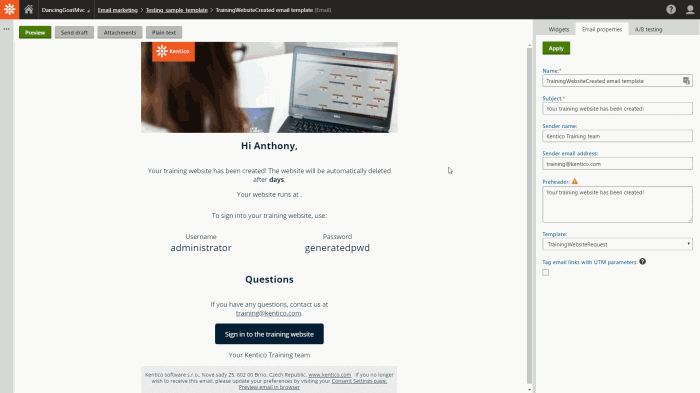
You can save the notification's HTML in as an email template and preview it in Kentico's email builder. You'll get the exact same experience as your recipients will when they receive the notification in their inboxes. What's even better, it's a great feature to tweak and debug the email.

- Spin up a trial version of Kentico.
- Import the media library with the notification's header image (zip, 3kB).
- Create a new Email template in the Email marketing application and copy the email's code into the template source field.
- Update the source of the <img> in the notification's header using the imported header image's Permanent URL
- Create a new Email feed that uses this template.
- Add a new email within this feed
- Enjoy the look and feel of the email on the Preview tab.
If you want to update and reuse the template, remember to test it vigorously before using it in your project.
And if you want to see the original notification arrive in your inbox, take one of our business courses and start your own training website. You'll learn about many of the exciting online marketing capabilities of Kentico and practice working with them on your own training website. And are you interested in HTML emails? Here a list of resources to help you get started.