Introducing CSS 3 Media Queries
In the
Introducing Responsive Design post we explored the basic concepts of a responsive website. We saw there were three major components;
fluid grid layouts, CSS 3 media queries, and fluid images and media. In this post we will look at CSS 3 media queries and how they can be used for designing responsive web sites.
Getting Started
Starting with CSS 2.1 media types were used to apply CSS for both screen and print. You may remember these wonderful statements.
<link rel="stylesheet" type="text/css" href="style.css" media="screen" />

<link rel="stylesheet" type="text/css" href="printfriendly.css" media="print" />
Sadly, CSS 2.1 media types were very limited and supported only the following generic media types.
|
Media type
|
Description
|
|
all
|
All devices.
|
|
braille
|
Intended for devices that provide braille tactical feedback.
|
|
handheld
|
Intended for typically small screen and limited bandwidth devices.
|
|
embossed
|
Intended for paged braille printers.
|
|
projection
|
Intended for projection devices.
|
|
screen
|
Intended for speech synthesizers.
|
|
tty
|
Intended for media using fixed pitch character grids.
|
|
tv
|
Intended for television type devices.
|
With CSS 3 media queries have drastically extended what was available. They can be used to identify a specific capability and then apply different styles based on the query. We can even combine queries that test for several features using semantic operators like AND and NOT. Features include width, height, max-width, max-height, device-height, orientation, aspect-ratio, resolution and more. Rather than looking for a specific type of device they look at the capability of the device. For example, detecting the user has a larger device like an iPad. The real value of media queries is that they allow conditions that can be screened for. This means that we can look for certain conditions that we can define and then create a conditional style sheet that we can then use.
The generic syntax of the CSS 3 media query is:
@media <media types> {

/* media-specific rules */

}
Media queries consist of media type expressions that evaluate to either true or false. The result evaluates to true if all expressions in the media query are true. When a media query is true the corresponding style sheet or style rules are applied following the normal CSS cascading rules.
Lets take a look at a simple example of using a media query by creating the following HTML page.
<!DOCTYPE html PUBLIC "-//W3C//DTD XHTML 1.0 Transitional//EN" "http://www.w3.org/TR/xhtml1/DTD/xhtml1-transitional.dtd">

<html xmlns="http://www.w3.org/1999/xhtml">

<head>

<style type="text/css">

@media screen and (max-width: 600px) {

p{

color:Red;

font-size:x-large;

}

}

</style>

<title>Simple Media Query Example</title>

</head>

<body>

<p> Welcome to Media Queries!</p>

</body>

</html>
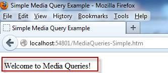
Lets run this in the browser at full screen (1936 x 1056) to see the following screenshot.
Lets decrease the browser size to 360 X 357 to see the updated style as shown in the following screenshot.
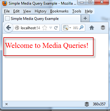
In this example, when this HTML page is decreased the p tag becomes Red and the font-size becomes extra-large based on the following media query expression.
@media screen and (max-width: 600px) {

p{

color:Red;

font-size:x-large;

}
CSS 3 Media Queries are able to evaluate a broad range of common features. The following is a list of the most common features, but always, make sure to check your target browser for support.
|
Feature
|
Value
|
Accepts Min/Max
|
Description
|
|
width
|
Number
|
Yes
|
Width of the targeted display area.
|
|
height
|
Number
|
Yes
|
The height of the targeted display area.
|
|
device-width
|
Number
|
Yes
|
The width of the devices entire screen.
|
|
Device-height
|
Number
|
Yes
|
The height of the devices entire screen.
|
|
orientation
|
Portrait/landscape
|
No
|
The orientation of the device. When width is larger than height landscape is returned, otherwise it returns portrait.
|
|
aspect-ratio
|
Ratio
|
Yes
|
Detects the ratio of value of the width media to the value of the height.
|
|
device-aspect-ratio
|
Ratio
|
Yes
|
Detects the ratio of value of the device-width value to the device-height value.
|
|
color
|
Integer
|
Yes
|
Detects the number of bits per color component of the device.
|
|
color-index
|
Integer
|
Yes
|
Number of entries in the color lookup table of the output device.
|
|
monochrome
|
Integer
|
Yes
|
Number of bits per pixel in a monochrome frame buffer.
|
|
resolution
|
Resolution
|
Yes
|
The resolution of the output device. Common units are dpi and dpcm
|
|
Scan
|
progressive/interface
|
No
|
The scanning process of tv output devices.
|
|
Grid
|
1 or 0
|
No
|
Detects whether the output device is a grid or bitmap based device.
|
Quick Examples
As you can see the usage of media queries is broad and provides a very rich set of information. To help make it easier I have tried to collect and list some of the common device examples to get started. If you have ones to add or better approaches please leave a comment.
Smartphone (portrait and landscape)
/* Smartphones (portrait and landscape) ----------- */

@media screen and (min-device-width : 320px)

and (max-device-width : 480px) {

/* Styles */

}
Smartphone (landscape)
/* Smartphones (landscape) ----------- */

@media screen and (min-width : 321px) {

/* Styles */

}
Smartphone (portrait)
/* Smartphone (portrait) ----------- */

@media screen and (max-width : 320px) {

/* Styles */

}
iPads (Portrait and landscape)
/* iPads (portrait and landscape) ----------- */

@media screen and (min-device-width : 768px) and (max-device-width : 1024px) {

/* Styles */

}
Ipads (landscape)
/* iPads (landscape) ----------- */

@media only screen and (min-device-width : 768px) and (max-device-width : 1024px) and (orientation : landscape) {

/* Styles */

}
Ipad (Portrait)
/* iPad (portrait) ----------- */

@media only screen and (min-device-width : 768px) and (max-device-width : 1024px) and (orientation : portrait) {

/* Styles */

}
Desktops and laptops
/* Desktop and laptop ----------- */

@media only screen and (min-width : 1224px) {

/* Styles */

}
Large screen
/* Large screens ----------- */

@media only screen and (min-width : 1824px) {

/* Styles */

}
iPhone 4
/* iPhone 4 ----------- */

@media only screen and (-webkit-min-device-pixel-ratio : 1.5),only screen and (min-device-pixel-ratio : 1.5) {

/* Styles */

}
Advanced Scenarios
Lets create a more advanced scenario with the following HTML.
<!DOCTYPE html PUBLIC "-//W3C//DTD XHTML 1.0 Transitional//EN" "http://www.w3.org/TR/xhtml1/DTD/xhtml1-transitional.dtd">

<html xmlns="http://www.w3.org/1999/xhtml">

<head>

<meta http-equiv="Content-Type" content="text/html; charset=UTF-8" />

<title>Simple Media Query Demos</title>

<style type="text/css">

.wrapper {

border: solid 1px #666;

padding: 5px 10px;

margin: 40px;

}

.viewing-area span {

color: #666;

display: none;

}

/* max-width */

@media screen and (max-width: 600px) {

.one {

background: #F9C;

}

span.lt600 {

display: inline-block;

}

}

/* min-width */

@media screen and (min-width: 900px) {

.two {

background: #F90;

}

span.gt900 {

display: inline-block;

}

}

/* min-width & max-width */

@media screen and (min-width: 600px) and (max-width: 900px) {

.three {

background: #9CF;

}

span.bt600-900 {

display: inline-block;

}

}

/* max device width */

@media screen and (max-device-width: 480px) {

.iphone {

background: #ccc;

}

}

</style>

</head>

<body>

<div class="wrapper one">This box will turn to pink if the viewing area is less than 600px</div>

<div class="wrapper two">This box will turn to orange if the viewing area is greater than 900px</div>

<div class="wrapper three">This box will turn to blue if the viewing area is between 600px and 900px</div>

<div class="wrapper iphone">This box will only apply to devices with max-device-width: 480px (ie. iPhone)</div>

<p class="viewing-area"><strong>Your current viewing area is:</strong> <span class="lt600">less than 600px</span> <span class="bt600-900">between 600 - 900px</span> <span class="gt900">greater than 900px</span></p>

<p>Adapted from a tutorial by <a href="http://www.webdesignerwall.com">Web Designer Wall</a></p>

</body>

</html>
Lets run this in the browser at full screen (1936 x 1056) to see the following screenshot.
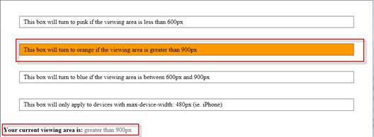
As you decrease the browser size have a little fun with the included media queries.
Conclusion
The samples presented here are basic examples and hopefully provide a starting point for your own development. In the real world, its important to make an informed decision where to focus any development efforts. The first step should always be to understand your target audience and the most common resolutions. The code shown in this post is available for download here.