Introducing Responsive Design
It’s not hard to see that your laptop computer isn’t the only piece of hardware that has a web browser. The web is on your phone, your tablet, your laptop and even your television. Web pages that take the multi-platform world into account are using Responsive Web Design (RWD). This is a set of techniques and ideas that look to adapt layouts based on the environment of the user's browser. Responsive Web Design is often associated with terms like fluid design, elastic layout, rubber layout, liquid design, adaptive layout, cross device design, and flexible design to name a few. This is the first of several blog posts that will look at how you can use Responsive Web Design.
What is a responsive design?
The iPhone was largely responsible for putting the spotlight on the mobile experience. This spotlight has made it clear that people expect to browse the web on their phone just as easily as the desktop. Nobody should argue that the spectrum of screen sizes and resolutions is increasing every day. In addition to mobile devices and computers, devices like touchscreens, high resolution monitors, tablets, and netbooks are becoming more common. Creating different version of a website that targets each individual device is not practical. This is where Responsive Web Design becomes important.
 Who coined the term Responsive Web Design?
You really cant talk about responsive design without mentioning its creator, Ethan Marcotte and his article about Responsive Web Design.
Responsive websites create the optimal viewing experience for any web page regardless of the screen size. This includes easy reading, navigation with a minimum of resizing, panning and scrolling across a wide range of display devices. Its important to understand that Responsive Web Design isnt a single piece of technology. There are three primary parts of building a responsive site as shown in the following table.
|
CSS 3 Media queries
|
Used to evaluate parts of the browser environment to determine which CSS to apply.
|
|
Fluid Grid Layouts
|
Used for relative CSS proportions for page layouts.
|
|
Fluid images and media
|
Making images scale to fit within the size constraints of their containers using CSS and scaling proportionally with the rest of the layout.
|
When is Responsive Design not needed?
Responsive design doesnt do away with native applications or dedicated mobile websites. Immersive mobile experiences and device specific functionality are great examples for these application types.
Getting started with Responsive Web Design
Responsive sites are very tuned into the size of the browser window. Within a browser, the viewport is the visible portion of the canvas. Essentially, this is the area the browser makes available to display your web page and is the size that that will determine how a web page is displayed. Screen size refers to the physical display area. Often these two are confused and you cant assume they are the same. Lets see what the screen resolution for our current monitor is and then compare this to our viewport dimensions.
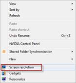
On the Windows desktop right click and in the pop-up menu select Screen resolution as shown in the following screenshot.
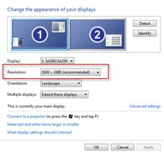
In the Change appearance of your displays menu we can see that the desktop resolution is set to 1920 X 1080 (recommended) as shown in the following screenshot.
When developing a responsive webpage how can you tell the current browser window size? Well, depending on your browser here are a couple of utilities that you can use.
Why are we using the desktop?
Resizing the desktop browser size is a good place to start when developing responsive site. However, testing on as many devices as possible is also essential.
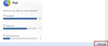
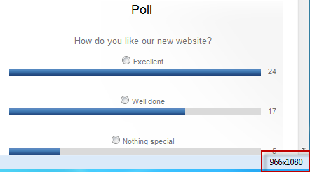
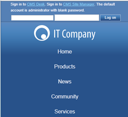
With the Firesizer utility installed, lets open the Home page of the Sample corporate site of Kentico CMS 7, and at the bottom of the page we can see the display size as shown in the following screenshot.
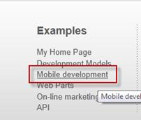
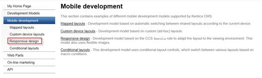
Now, lets take a look at a pre-built responsive page. In the Kentico CMS sample corporate site Home page at the bottom in the Examples column click the Mobile development link as shown in the following screenshot.
In the left hand menu select Responsive design as shown in the following screenshot.
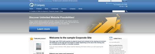
With the web page fully expanded we can see that it contains a nice wide border and a standard three column layout with padding that displays nicely on the 1920 X 1080 widescreen monitor as shown in the following screenshot.
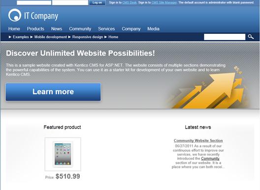
If we decrease the page size to about half the size of the monitor we can see that the layout responds by moving to a two column layout as shown in the following screenshot.
If we look at the bottom of the screen we can see the browser window size as shown in the following screenshot.
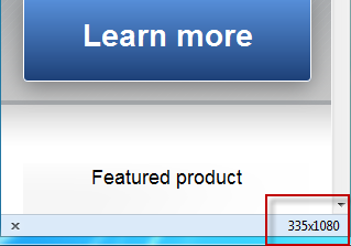
If we decrease the size again down to about a third of the total screen we can see that the layout changes to a single column layout as shown in the following screenshot.
If we look at the bottom of the screen we can see the browser window size as shown in the following screenshot.
Conclusion
In this first blog post we just started scratching the surface of Responsive Web Design. We looked at the definition and basic techniques that are used to build pages that provide an optimal experience for the multi-platform world. We also looked at an example page that demonstrates Responsive design.