Developer e-learning course released in full
Last month, we released the third and most important module of the Kentico Xperience 13 for developers course—the Builders module. This completes the journey to a comprehensive developer e-learning course that prepares your team for Xperience development.
We took the job of preparing the course seriously—no stone was left unturned. But we're sure it was worth the wait.
Let's quickly summarize what you'll encounter when taking the course.
The Essentials module
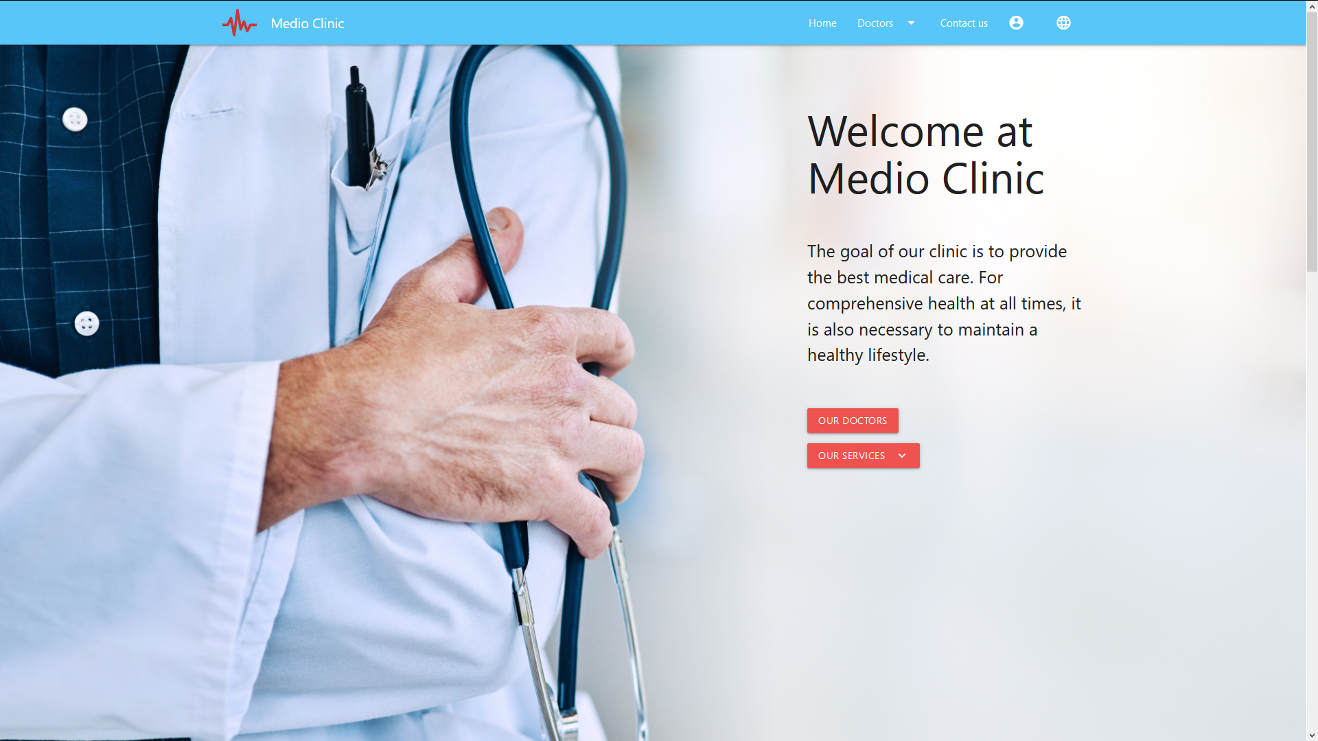
This module prepares you for Xperience development in a zero-to-hero manner. From the very first steps to a fully working website of a fictional medical institution called Medio Clinic.
We did a complete overwrite, only cherry-picking what was good in the previous version of the course. But otherwise, every time we saw a potential to improve the technical design, we did that.
New website design

Not only we made the looks in line with today's graphical trends, but we also totally revamped the HTML markup and the structure of CSS styles. We also brought the SASS framework to the party to keep the stylesheets clean and concise.
Advantage for developers
|
Advantage for marketers and editors
|
|
You can now follow the DRY principle. Styles can inherit from each other, include portions of other styles, etc.
|
When reviewing developer's work and suggesting changes of the graphical design, editors can now easily inspect the HTML structure without lots of unnecessary <div> elements and CSS selectors.
|
ASP.NET Core
We invested in the newest and greatest technology—ASP.NET Core 3.1. The website follows all best practices and architectural patterns that Microsoft and the ASP.NET community cherish.
Advantage for developers
|
Advantage for marketers and editors
|
|
The code is easy to understand, maintainable, without workarounds.
|
The website is much faster than MVC 5.
|
Architecture
We revamped the structure of the solution, as well as the design of all individual components. For instance, the Medio Clinic solution was dissected into 5 standalone projects. Also, we made the repository pattern a first-class citizen. You now can learn how to create a flexible and maintainable repository infrastructure that lets you introduce new page types with just a few lines of new code.
Advantage for developers
|
Advantage for marketers and editors
|
|
Cross-cutting concerns are being dealt with in a uniform way. New or altered functionality does not break the whole solution. The code can be covered by automated tests.
|
Developers can now react to the ever-changing business requirements faster.
|
Content tree-based routing
The Essentials module teaches how to crank up a new site quickly, without the hassle of conventional ASP.NET routing. Gone are the days of defining URL patterns for each and every section of the website. The Medio Clinic site showcases how content editors can intuitively define the URLs by just moving around content pages in the administration interface. All of that thanks to the built-in content tree-based router in Xperience 13.
Advantage for developers
|
Advantage for marketers and editors
|
|
You no longer have to assist in each reshuffle in the content tree. At the same time, you don't have to sacrifice content governance. You can mix with the conventional routing, where it makes sense.
|
You can mix and match URLs, translate them, and polish the structure with a speed of a mouse click.
|
User-modeled navigation
Hand in hand with the user-modeled routing also comes the user-modeled navigation. The Medio Clinic website is a living example of how new menu items can be added by content editors, just by selecting a checkbox.
You can also learn how to back your live site with a robust and fast navigation repository class.
Advantage for developers
|
Advantage for marketers and editors
|
|
You can leave the burden of menu maintenance fully in the hands of content editors.
|
Simplified adding and removing of menu items.
|
The Builders module
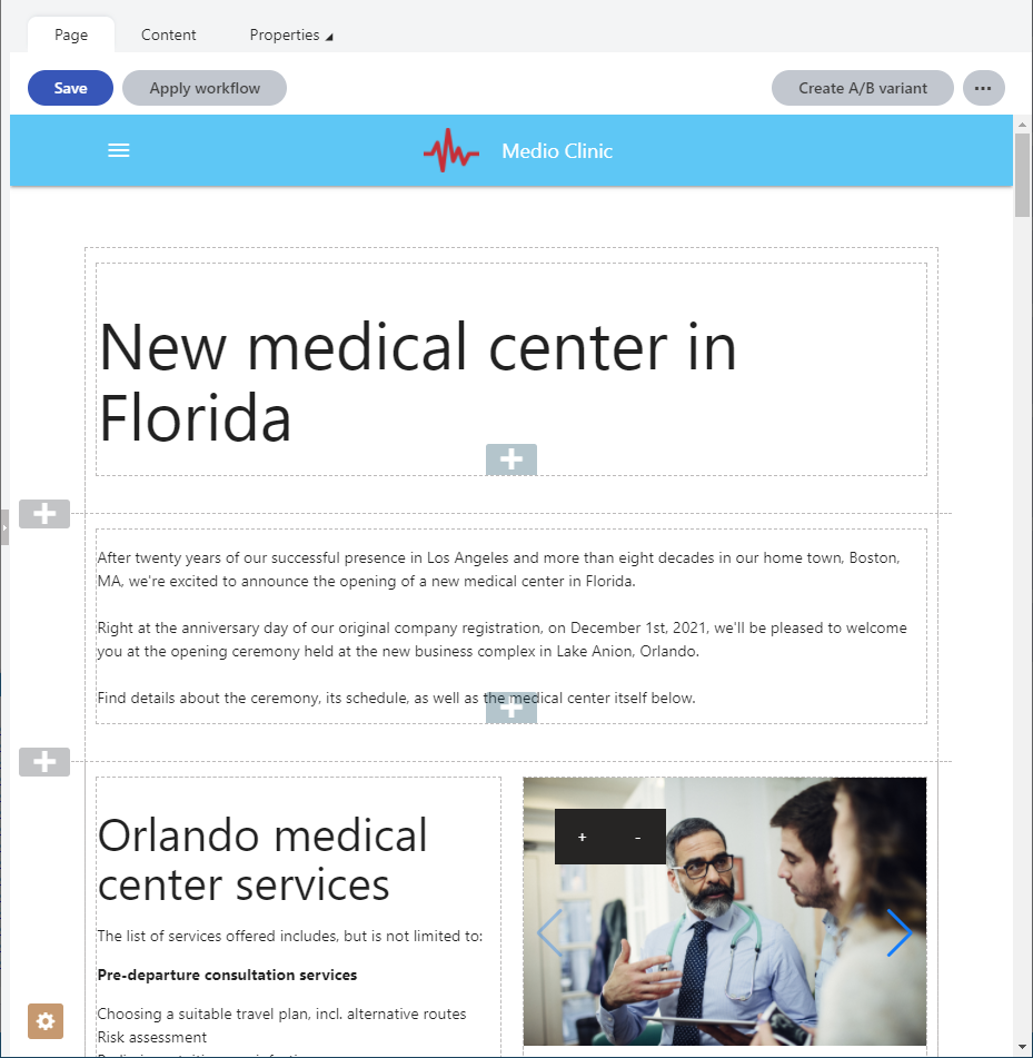
We incorporated many of the Page Builder and Form Builder features of Xperience 13 into this module.

You will develop the same kind of functionality as you did in the previous version of the course. However, you will now achieve that through the newest technology and practices. For instance, widgets now exist as ASP.NET Core MVC view components. Also, every time it was possible, page sections, inline editors, and other simple components exist as just views. You don’t have to implement empty controllers anymore.
Page Builder development
In the module, you'll start with two-page sections. One that statically defines the region for widgets, another one that's configurable by content editors.
You'll then move onto widgets. You'll start with the simplest possible working widget that takes textual input and displays that on the live site. Once you get familiar with the basics, you'll create a static image widget. This one will explain both concepts of taking the editor's input—inline editors and the configuration dialog. You'll then finalize the Page Builder efforts by implementing an image slideshow widget. This one introduces advanced concepts of adding custom JavaScript logic in a clean and maintainable way.
Advantage for developers
|
Advantage for marketers and editors
|
|
The widgets are explained from the simplest-possible one to the production-grade one.
|
The widgets are implemented in a safe manner, without the risk of interfering with each other on the page.
|
Page template development
As in the previous version of the course, you'll create two-page templates—a simple landing page template and an event landing page template. However, this time we simplified the development of the latter by using a third-party component.
Advantage for developers
|
Advantage for marketers and editors
|
|
The templates let you enforce some rules in the page design, while also leaving lots of freedom in the hands of content editors.
|
Not only can be the templates used to directly create pages, they can also be furnished with some content and saved as blueprints for future pages.
|
Form Builder development
All of the form components, editing components, and the validation rule from the previous version have been updated to reflect today's best practices.
Compared to the previous version of the course, the implementation of forms outside of Page Builder pages is simplified. You no longer have to use the tedious ASP.NET approach and can now render the built-in Form widget in an arbitrary MVC view.
Advantage for developers
|
Advantage for marketers and editors
|
|
When outside of Page Builder pages, the form can be implemented much faster.
|
Outside of Page Builder, the form always looks and behaves in the very same ways as in a Page Builder page.
|
The Identity module

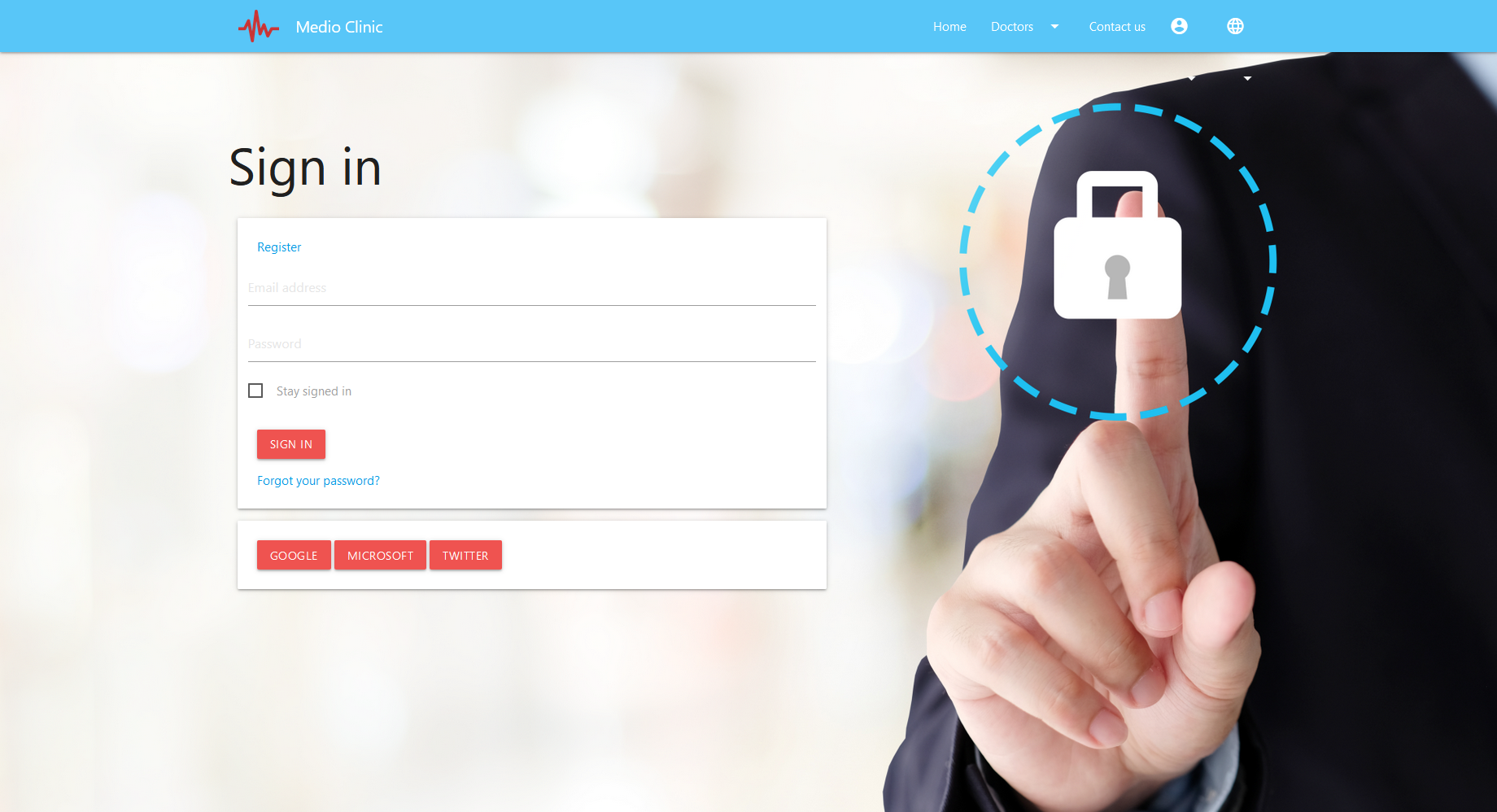
The module teaches the implementation of user registration, sign-in/sign-out, and the creation of secured website sections.
Alongside the codebase upgrade to the newest ASP.NET Core Identity, we made some cool new additions to the solution.
-
The Medio Clinic website now supports signing in via external authentication providers like Facebook, Google, Microsoft, or Twitter.
-
The website section dedicated to user identities showcases how both the content tree-based and the conventional routing can live alongside each other in one project.
-
The registration, sign-in/sign-out, and other identity-related pages were moved into a standalone MVC area.
-
All ASP.NET Identity code was moved into a standalone Visual Studio project.
-
The secured user profile page now displays user avatars in much easier ways.
-
The upload of user avatars is done with state-of-the-art security measures.
Are you up for the challenge?
Whether you're a digital agency or an in-house development team, you'll find the right guidance in the Kentico Xperience 13 for developers course. If you're a Kentico partner, you have free access to all our courses. If you're an end client of Kentico, feel free to contact your digital agency or directly our sales representatives to get access to the course.
Enjoy your learning!