Introducing Fluid Grid Layouts
In the previous post, Introducing Responsive Design we explored the basic concepts of a responsive website. We saw there were three major components; fluid grid layouts, CSS 3 media queries, and fluid images and media. In this second blog post we will look at the basics of fluid grid layouts and how they are used for designing responsive sites.
Grids solve the basic problem of alignment. A traditional web design defines a number of pixels across a page and then lays out the content to match the grid design. A quick Google search can reveal that there is no shortage of grid systems. The 960 pixel grid system is probably the most commonly used. Why? The number 960 makes for a lot of clean divisions utilizing a whole number when factoring column widths and margins; and technically fits nicely on a majority of screens.
The problem with pixels
Lets start by taking a look at a simple 960 pixel based HTML page with an inline CSS using the code shown below.
<!DOCTYPE html PUBLIC "-//W3C//DTD XHTML 1.0 Transitional//EN" "http://www.w3.org/TR/xhtml1/DTD/xhtml1- transitional.dtd">
<html xmlns="http://www.w3.org/1999/xhtml">
<head>
<title>Welcome to the new world</title>
<style type="text/css">
body
{
width:100%;
font: normal 100% Cambria, Georgia, serif;
font-size: 1em;
color: black;
margin: 0;
padding: 0;
}
</style>
</head>
<body>
<div>
<h1>Hello World</h1>
<p>Lorem ipsum dolsum Lorem ipsum dolsum Lorem ipsum dolsum Lorem ipsum dolsum Lorem ipsum dolsum Lorem ipsum dolsum Lorem ipsum dolsum Lorem ipsum dolsum Lorem ipsum dolsum Lorem ipsum dolsum Lorem ipsum dolsum Lorem ipsum dolsum Lorem ipsum dolsum Lorem ipsum dolsum Lorem ipsum dolsum Lorem ipsum dolsum Lorem ipsum dolsum Lorem ipsum dolsum Lorem ipsum dolsum Lorem ipsum dolsum Lorem ipsum dolsum Lorem ipsum dolsum Lorem ipsum dolsum Lorem ipsum dolsum</p>
</div>
</body>
</html>
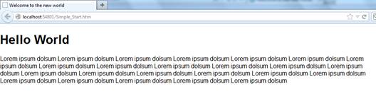
When run in full screen (1296x776) the HTML produces the following screenshot.
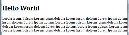
Now, lets make the window half the width of the screen (612x760) and we can see the design gets cut off as shown in the following screenshot.
When designing a responsive site every aspect of the site needs to be scaled appropriately. A quick review of CSS shows that in addition to pixels it also supports the following measurement types.
|
Unit type
|
Description
|
|
%
|
Percentage
|
|
in
|
Inch
|
|
cm
|
Centimeter
|
|
mm
|
Millimeter
|
|
em
|
1 em is equal to the current font size.
|
|
ex
|
1 ex is the x-height of a font (x-height is usually about half the font-size)
|
|
pt
|
Point (1 pt is the same as 1/72 inch)
|
|
pc
|
Pica (1 pc is the same as 12 points)
|
|
px
|
Pixels (a dot on the computer screen)
|
Moving to Responsive Design
A liquid or fluid grid goes beyond the traditional layout. Instead of designing a layout based on a rigid set of pixels a fluid grid is designed in terms of percentages (%). This means that a 50% width will always take up half the screen. This way when a layout is squeezed onto a small device or stretched across a huge screen, all of the elements in the layout will resize their widths in relation to each other.
Converting a pixel based layout to a proportional design isnt incredibly complicated but does require some math as shown in the following formula.
Target Context = Result
Here are the important parts of the formula that you should keep in mind.
|
Target
|
The size of the element in pixels.
|
|
Context
|
The size of the containing control in pixels.
|
|
Result
|
The proportional CSS rule as a percentage.
|
Lets see how this formula works by converting the simple page we created earlier. This page defines a container of 960 pixels. We want our resulting fluid grid to have the same proportion as the current design. So we will base our calculations on the 960 pixel baseline. So this makes the fluid formula very easy as shown below.
960 960 = 100%
If we modify the code it should now look like the following.
<!DOCTYPE html PUBLIC "-//W3C//DTD XHTML 1.0 Transitional//EN" "http://www.w3.org/TR/xhtml1/DTD/xhtml1- transitional.dtd">
<html xmlns="http://www.w3.org/1999/xhtml">
<head>
<title>Welcome to the new world</title>
<style type="text/css">
body
{
width:100%; /*960px*/
font: normal 100% Cambria, Georgia, serif;
font-size: 1em;
color: black;
margin: 0;
padding: 0;
}
</style>
</head>
<body>
<div>
<h1>Hello World</h1>
<p>Lorem ipsum dolsum Lorem ipsum dolsum Lorem ipsum dolsum Lorem ipsum dolsum Lorem ipsum dolsum Lorem ipsum dolsum Lorem ipsum dolsum Lorem ipsum dolsum Lorem ipsum dolsum Lorem ipsum dolsum Lorem ipsum dolsum Lorem ipsum dolsum Lorem ipsum dolsum Lorem ipsum dolsum Lorem ipsum dolsum Lorem ipsum dolsum Lorem ipsum dolsum Lorem ipsum dolsum Lorem ipsum dolsum Lorem ipsum dolsum Lorem ipsum dolsum Lorem ipsum dolsum Lorem ipsum dolsum Lorem ipsum dolsum</p>
</div>
</body>
</html>
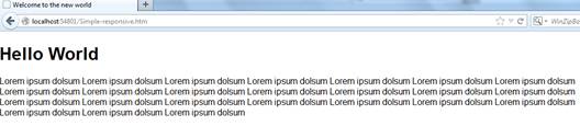
When run in full screen (1296x776) the HTML produces the following screenshot.
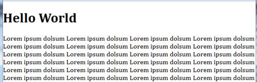
Now, lets make the window half the width of the screen (621x760) and we can see the following screenshot.
 Dont forget
Fluid grids are an important part of responsive design. However, they can only take you so far. Often when the width of a browser becomes too narrow the design starts to break down. This is where media queries become important.
2 Column Design
Lets take a more complicated 2 column design that contains the following HTML.
<!DOCTYPE html>
<html>
<head>
<title>2 Column CSS Layout</title>
<meta name="description" content="Demo of a simple 2 column css layout" />
<style type="text/css">
body {font: normal 16px helvetica, arial, sans-serif}
p {text-align:center}
#container {
width:960px;
height:500px;
}
#header
{
width:960px;
text-align:center;
background: #777;
color:#fff;
height:100px;
}
#content {
float:left;
width:610px;
text-align:center;
height:300px;
background:#ccc;
}
#sidebar {
float:left;
width:350px;
text-align:center;
height:300px;
background:#eee;
}
#footer
{
width:960px;
clear:both;
text-align:center;
background: #555;
color:#fff;
height:100px;
}
</style>
</head>
<body>
<div id="container">
<div id="header">
<p>Header</p>
</div>
<div id="content">
<p>Main content</p>
</div>
<div id="sidebar">
<p>Sidebar</p>
</div>
<div id="footer">
<p>Footer</p>
</div>
</div>
</body>
</html>
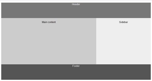
When run in full screen (1296x776) the HTML produces the following screenshot.

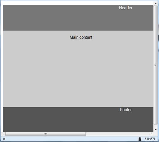
Now, lets make the window half the width of the screen (631x676) and we can see the following screenshot where the design becomes cut off.
Using the responsive design formula above lets convert the HTML file to the following.
<!DOCTYPE html>
<html>
<head>
<title>2 Column CSS Layout</title>
<meta name="description" content="Demo of a simple 2 column css layout" />
<style type="text/css">
body, html
{
font: normal 1em helvetica, arial, sans-serif; /*16px*/
height: 100%;
}
p {text-align:center}
#container
{
width: 100%; /*960px*/
height:100%; /*500px*/
}
#header
{
width:100%; /*960px*/
text-align:center;
background: #777;
color:#fff;
height:20% /*100px*/
}
#content {
float:left;
width:63.54166666666667%; /*610px*/
text-align:center;
height:60%; /*300px*/
background:#ccc;
}
#sidebar {
float:left;
width:36.4583333333333%; /*350px*/
text-align:center;
height:60%; /*300px*/
background:#eee;
}
#footer
{
width:100%; /*960px*/
clear:both;
text-align:center;
background: #555;
color:#fff;
height:20%; /*100px*/
}
</style>
</head>
<body>
<div id="container">
<div id="header">
<p>Header</p>
</div>
<div id="content">
<p>Main content</p>
</div>
<div id="sidebar">
<p>Sidebar</p>
</div>
<div id="footer">
<p>Footer</p>
</div>
</div>
</body>
</html>
When run in full screen (1296x776) the HTML produces the following screenshot.
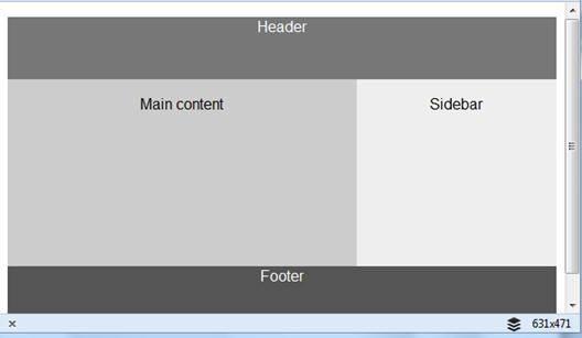
Now, lets make the window half the width of the screen (631x471) and we can see the design becomes responsive as shown in the following screenshot.
Conclusion
In this second part we look at the basics of fluid grids within responsive design. We looked at how you can convert existing pixel based layouts to fluid grids. The code demonstrated is available for download from here.