|
|

Developing widgets |

|

|

|

|
|
Developing widgets |
|
|

|
|
|
|
Developing widgets |
|
|
|
|
|
Developing widgets |
|
|
|
|
|
|
||
This topic leads you through the process of creating a widget. As a site developer, you can create your own widgets. Every widget is based on an existing web part, so if you require a widget with completely new custom functionality, you need to develop the appropriate web part first.
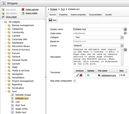
1. As mentioned above, it is not possible to create a widget without a reference to a web part. To start, switch to Site Manager -> Development -> Widgets to access the administration interface where widgets can be created. You should see a screen similar to the following one.
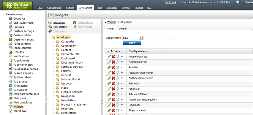
2. Widgets are grouped into categories. It is important to note that categories are used for the sake of organization only. The category under which a given widget is stored has no influence on who can use or modify the widget.
Clicking on a node causes the selected category to open and all widgets stored within that category are listed. You can also change the Display and Code name of a category on the General tab. The Image path property sets the path to the image that will be used as the category's icon in the Add widget dialog (the recommended image size is 16x16px).
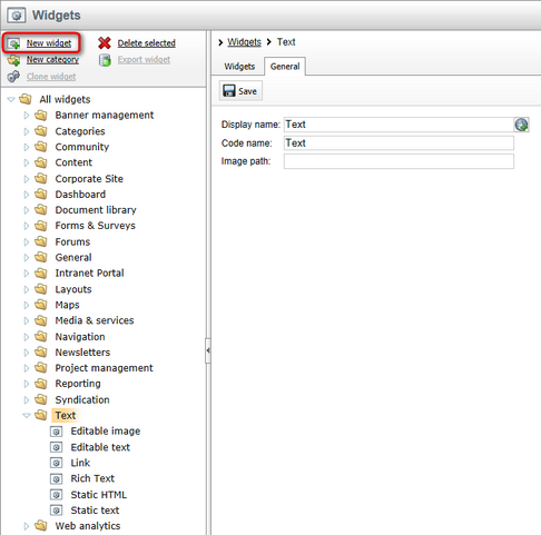
Now select the category where the new widget should be stored, for example Text, and click the  New widget link. Alternatively, you can create the new widget under any folder and change its location later when the properties of the widget are defined.
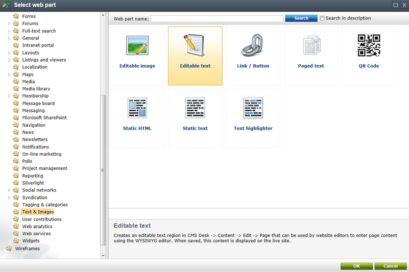
3. A dialog opens, where you can select the web part that will be used as a template for the new widget. In the example below, the Editable text web part from the Text & Images category is selected. Click the OK button to confirm the selection.
4. A new widget has just been created. You can manage widgets using the actions above the tree. A new widget can be created based on an existing one using  Clone widget. If you wish to add a new category, use
  New category.
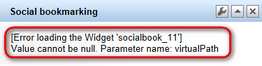
To delete a selected widget or an entire category (except the All widgets category), click  Delete selected. Please bear in mind that when a widget is deleted, it is not automatically removed from page templates. Therefore, when pages containing a deleted widget are to be displayed, an error message will be displayed instead of the missing widget.
The example below shows the effect of deleting the Social bookmarking widget without removing it from the page templates.
A selected widget can also be exported by clicking on  Export widget. For details regarding export see Exporting single objects.
5. For each selected widget there are five tabs available. On the General tab there are all the basic settings:
•Display name - sets a name for the widget that will be used in the administration interface and widget selection dialog.
•Code name - sets a name that will serve as a unique identifier for the widget.
•Category - shows the category to which the widget belongs. You can change it here by selecting a new category from the drop‑down list.
•Based on - displays the name of the parent web part that the widget is derived from.
•Layout - allows you to choose one of the layouts defined for the parent web part. The selected layout will be applied to all instances of the widget across all sites. A layout may be used to modify the widget's appearance or design and even add further content into it. If you wish to use a different layout for certain instances of the same widget, you can make a clone of the widget for this purpose and have it use the alternative layout. For more information about web part layouts and how they can be created, please see the Customizing web part layout topic.
•Description - a text description that is displayed in the widget selection dialog and in widget documentation.
•Thumbnail - sets the image used as a graphical representation in the widget selection dialog.
•Skip initial configuration - if enabled, new instances of the widget will be added directly to the page without opening the property configuration dialog. This can make the widget easier to use and helps save time, particularly in the case of widgets that are usually left with their default property values.
Perform any changes required and click the  Save button.
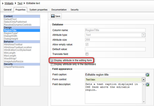
6. The Properties tab includes all the properties taken from the parent web part.
•Using the Display attribute in the editing form checkbox, you can choose if a given property should be available in the widget configuration dialog. You can notice that all properties are hidden by default.
•If the Display attribute only in the dashboard box is also checked, the property is only accessible when configuring the widget on one of the dashboard sections located in the CMS administration interface.
Changes must be confirmed by clicking Save.
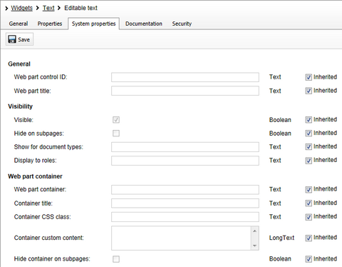
7. The System properties tab contains the general properties that all widgets and web parts have in common. Their default values can be modified by clearing the Inherited checkbox and entering the desired value into the appropriate field. All changes must be confirmed by clicking Save.
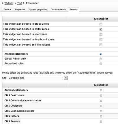
8. On the Security tab, there are settings specifying where and by what type of users the widget can be used. The details are given in the widgets Security topic.
9. Once all settings are configured as needed, the widget is ready to be used on the website's pages.