|
|

Overview |

|

|

|

|
|
Overview |
|
|

|
|
|
|
Overview |
|
|
|
|
|
Overview |
|
|
|
|
|
|
||
Web parts represent a block of content or combination of content and functionality. They are the basic building blocks of portal engine page templates. Using existing web parts, users with the appropriate permissions (Design web site from the Module -> Design permission matrix) can build or modify the structure of pages directly from a browser by using the CMS Desk -> Content -> Edit -> Design interface. All web parts must be placed into web part zones.
From a developer's point of view, a web part is a user control (ASCX) that inherits from the CMSPortalControls.CMSAbstractWebPart class. You can easily create your own web parts as described in the Developing web parts topic.
The Kentico CMS installation contains many built-in web parts, but sometimes it may be necessary to modify the behavior, design or functionality of one of them. The Modifying web parts sub-chapter covers several ways how this can be done.
All web parts have the option of using an AJAX UpdatePanel. More information can be found in the AJAX support topic.
Also of interest may be Widgets, which provide functionality similar to web parts, but allow further personalization by users.
Web parts can be managed in Site Manager -> Development -> Web parts. Here you can see all web parts organized into categories in a tree structure. Each web part has the following properties on the General tab:
•Display name - name of the web part displayed in the administration interface.
•Code name - name of the web part used in website code.
•Category - here you can choose the category of the web part catalog where the web part will be placed.
•Type - sets the type of the web part, which affects its behaviour and properties. Different web part types are also marked with different colors and icons on the Design tab of CMS Desk. The following web part types are available:
•Standard - typical web parts displaying some content.
•Data source - do not display any content, only provide data to be displayed by a connected web part.
•Filter - can be connected to a data source and enables users to limit the range of the data provided by it.
•Placeholder - used for the General -> Layout -> Page placeholder web part, which specifies an area where the content of sub-pages should be displayed.
•Invisible - are not displayed on the page at all and usually perform some type of background task.
•Basic - basic web parts without partial caching and AJAX UpdatePanel support.
•Layout - these web parts can be used to generate a specific layout for page content by defining additional web part zones. For more information, please see the Layout web parts sub‑chapter.
•Widget only - these web parts are only intended to serve as base templates for widgets and are not available in the web part selection dialog on the Design tab of CMS Desk. Please keep in mind that changing a web part that is already on some page template to this type will not remove it or prevent it from functioning.
•File name - contains a relative path to the user control that implements the web part. The path starts from the CMSWebParts folder. It is recommended to organize the web parts on the disk in the same way as in the categories. Example: Search/cmscompletesearchdialog.ascx
•Description - a text description of the web part that will be displayed in the web part catalog.
•Thumbnail - image used in the web part catalog.
On the Properties tab, you can define the web part properties and how they appear in the Web part properties configuration dialog.
Each web part has the following default properties. These properties are loaded automatically when the web part is defined and their default values can be specified on the System properties tab. If you wish to modify more than the default value of one of these properties, such as its behavior and attributes (e.g. for it not to be displayed in the web part configuration dialog) you can do so by adding and configuring it on the Properties tab.
Default
•Web part control ID - serves as an identifier for the web part. This ID must be unique within the context of each page template. The value of this property may only contain alphanumeric characters and the underscore character ( _ ). It is recommended to keep the ID short to minimize the total size of the page’s output code.
•Web part title - title of the web part displayed on the Design tab of CMS Desk. If empty, the value of the Web part control ID property is used for this purpose.
•Disable view state - indicates if view state should be disabled for the web part.
•Disable macros - if checked, macros contained in the values of the web part's properties will no longer be resolved.
Visibility
•Visible - indicates if the web part should be displayed.
•Hide on subpages - indicates if the web part should be hidden on sub-pages. If checked, the web part will not be displayed on documents that inherit the web part from a parent document.
•Show for document types - contains a list of document types on which the web part should be displayed. If the currently selected document uses the page template containing the web part, but its type is not specified by this property, the web part will be hidden. The document types in the list must be specified by their code names and separated by semicolons (;). If empty, the web part will be displayed on all document types.
•Display to roles - contains a list of roles to which the web part should be displayed. This may be used to implement documents with specific functionality for different types of users. The roles in the list must be specified by their code names and separated by semicolons (;). If empty, the web part will be displayed to all users.
Web part container
•Web part container - specifies the name of the Web part container (box) to be displayed around the web part. Only the containers defined at Site Manager -> Development -> Web part containers can be selected. The selected container can be edited directly by using the Edit button.
•Container title - sets a title for the container. This title is displayed only if the {%ContainerTitle%} macro is used in the code of the container.
•Container CSS class - CSS class used for the web part's container. Applied only if the {%ContainerCSSClass%} macro is used as the value of a Class attribute somewhere in the code of the container.
•Container custom content - may be used to pass a text parameter to the specified web part container. Applied only if the {%ContainerCustomContent%} macro is used in the code of the container.
•Hide container on subpages - if enabled, the container will not be displayed around the web part on child documents that inherit it through visual inheritance. For example, this allows you to add a container for a master page only.
HTML Envelope
•Content before - HTML content placed before the web part. Can be used to display a header or add some encapsulating code, such as <div> or <table> elements to achieve the required layout.
•Content after - HTML content placed after the web part. Can be used to display a footer or close the tags contained in the ContentBefore value, such as </div> or </table> elements.
AJAX
•Use update panel - indicates if an AJAX UpdatePanel container should be used for the web part.
Time zones
•Time zone - specifies the type of time zone used for the content of the web part. The following types are available:
•Inherit - inherits the time zone settings from the Page placeholder web part used to display the page template containing this web part (typically the one on the master page).
•Server - server time zone settings will be used by the web part.
•Web site - website time zone settings will be used by the web part.
•User - time zone settings of individual users will be used by the web part.
•Custom - some other time zone will be used based on the selection done in the Custom time zone property.
•Custom time zone - may be used to assign a custom time zone specifically for the content of this web part. If selected, the time zone will be used regardless of current user or website time zone settings.
Partial caching
•Partial cache minutes - sets the number of minutes for which the output HTML code of the web part should remain cached. This process is similar to full‑page caching, but only for the code of the web part specifically. If left empty or set to 0, partial caching will be not be used for the web part.
•Partial cache dependencies - contains a list of cache keys on which the partial cache of the web part depends. When the specified cache items change, the partial cache of the web part is deleted. Each line may only contain a single item. If the Use default cache dependencies box is checked, the default dependencies will be used, which include all possible object changes that could affect the specific web part.
The structure of a web part, its content before/after sections and a Web part container is the following:
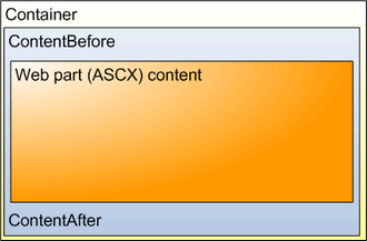
The containers, unlike the ContentBefore and ContentAfter sections, are re-usable and they can contain dynamically inserted values of web part properties.
|
Storing files related to web parts
If your web part consists of several files (such as ASCX controls, images, js scripts, etc.), you should place these files in a sub‑folder under the folder where your main web part ASCX file is placed. If the code name of the web part is MyWebPart, the sub‑folder's name must be MyWebPart_Files. This will ensure that the additional files are exported/imported correctly when you move your website or when you distribute the web part to other developers. |
You can define any CSS classes needed to correctly display a web part by editing it in on the CSS tab. If the styles require any files (such as images), you can add them on the Theme tab. This stylesheet will then be automatically requested on all pages where the given web part is placed (in addition to the website or page‑specific stylesheet). For more information about page component CSS styles, please see the Development -> CSS stylesheets and design -> CSS for page components topic.
If you need to ensure that a certain CSS class is applied to the content of a web part, there are several options. You can simply use a container or the Content before / after properties to enclose the web part into a HTML element containing the appropriate class. Alternatively, you may define a new property for any web part using the Column name CssClass and Attribute type Text. Entering the name of a CSS class from your stylesheet as this property's value will automatically wrap the given web part instance into a <Div> element applying the specified class.
You can add your own documentation to a web part on the Documentation tab. If you wish to document particular properties, you need to fill in the Field description on the Properties tab.
For complete documentation of all web parts, please see the Kentico CMS Web Parts reference.
To generate full web part documentation in a printable format, enter <website URL>/CMSPages/Dialogs/documentation.aspx?allwebparts=true into your browser. It is recommended to use FireFox for correct formatting and page breaking.
