Mapping shared layouts |

|

|

|

|
|
Mapping shared layouts |

|

|

|

|
|
|
||
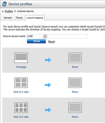
Device profiles allow you to replace shared page layouts with other layouts that are customized for displaying on the particular device. For example, if a page uses a three-column layout, it won't fit on a mobile phone's display. Using layout mappings, you can replace the columns with rows and thus reorganize the content of the page to be readable on the particular device.
You can only create mappings for layouts that are convertible.
1. Go to Site Manager -> Development -> Page layouts and edit the layout for which you want to have alternatives for different devices.
2. Check the Is convertible box.
3. Enter the Number of zones that the layout contains. The system automatically counts the number of web part zones in the layout code, but you can manually override the value (for example in the case of conditional layouts or layouts that load web part zones dynamically).
4. Save the layout.
The layout appears in the list of layouts on the Layout mapping tab in the device profile editing interface, where you can map it to a layout that will replace it when the particular device requests a page that uses the layout.
Prerequisite: Enable the Enable layout mapping setting for the website in Site Manager -> Settings -> Content -> Content management.
1. Go to Site Manager -> Development -> Device profiles and edit the device profile for which you want to map layouts.
2. Switch to the Layout mapping tab.

3. Find the layout that you want to create a mapping for on the left side of the grid.
4. Click the question mark on the right side to create a new mapping, or click a mapped layout on the right side to change the mapping. The Select a target layout dialog opens.
5. If you want to select a layout that has a different number of web part zones than the original, uncheck Show only layouts with a matching number of zones.
6. Click a layout to select it and click OK to confirm the selection.
The mapping is complete. If a device requests a page that uses the layout on the left and the device fits the device profile, the page will use the mapped layout instead.
You can now start designing pages for different device profiles using the Design mode in CMS Desk in combination with the device selector. See Creating mobile pages for details.