|
CMSTabControl |

|

|

|

|
|
CMSTabControl |
|
|
|
|
The CMSTabControl control is inherited from the BasicTabControl control. It allows you to display one-level tab menu based on data from Kentico CMS. It reads specified documents and renders the menu according to their values.
It allows you to display menu items specified using their path, depth, document type and WHERE condition. The CMSTabControl control displays content without writing any additional code. The items are sorted by MenuItemOrder and MenuItemCaption values.
See also: Using macro expressions in menu items, Using the CSSPrefix property for design of sub-menus
Inherits: BasicTabControl, CMSMenuProperties - common properties
Properties
Property Name |
Description |
Sample Value |
HighlightedNodePath |
Path of the item that will be highlighted like it was selected. |
"/products/notebooks" |
RenderImageAlt |
Indicates if the ALT attribute should be rendered for images used in the menu (for XHTML compatibility). |
|
LoadDataAutomaticaly |
Indicates if data for the control should be loaded automatically. By default, the data is loaded automatically.
If you set this property to false, you can supply custom DataSet to the DataSource property and then call the ReloadData(false) method. |
|
RenderedHTML |
Allows you to get or set the HTML code rendered by the control.
You need to set this property before the Render event - e.g. in the OnLoad event. |
Methods
Method Name |
Description |
ReloadData |
Reloads the data.
If the forceLoad parameter is set to false and the custom value is assigned to the DataSource property, the properties of the CMSListMenu control are not used and only the data from the DataSource are used. |
Design
You can modify the design using the same classes as for the BasicTabControl control.
Example
This example will show you how to display a simple tab-menu based on the CMS content. It assumes that you have configured your project for Kentico CMS Controls.
| • | Create a new Web form. |
| • | Drag and drop the CMSTabControl control on the form. |
| • | In Source mode add the following CSS styles inside the <BODY> tag. It will modify the appearance of the tabs. |
[C#], [VB.NET]
<style type="text/css"> .TabControlTable { FONT-SIZE: 14px; FONT-FAMILY: Arial,Verdana } .TabControlRow { } .TabControl { BORDER-RIGHT: black 1px solid; BORDER-TOP: black 1px solid; FONT-WEIGHT: bold; BACKGROUND: #e7e7ff; BORDER-LEFT: black 1px solid; CURSOR: hand; COLOR: black } .TabControlSelected { BORDER-RIGHT: black 1px solid; BORDER-TOP: black 1px solid; FONT-WEIGHT: bold; BACKGROUND: #4a3c8c; BORDER-LEFT: black 1px solid; CURSOR: default; COLOR: white } .TabControlLinkSelected { COLOR: white; TEXT-DECORATION: none } .TabControlLink { COLOR: black; TEXT-DECORATION: none } .TabControlLeft { WIDTH: 1px } .TabControlRight { WIDTH: 0px } .TabControlSelectedLeft { WIDTH: 1px } .TabControlSelectedRight { WIDTH: 0px } </style> |
| • | Add the following table code just after the CMSTabControl tags. It will display a stripe under the tabs. |
[C#], [VB.NET]
<hr style="width:100%; height:2px; margin-top:0px;" /> |
| • | Switch back to the Design mode. |
| • | In the Properties window set the following property values: |
| • | MaxRelativeLevel: 1 |
| • | Path: /% |
| • | Compile and run the project. You will see a page like this: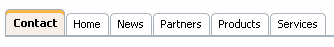 |
Page url: http://devnet.kentico.com/docs/controls/index.html?cmstabcontrol.htm

