|
Developing widgets |

|

|

|

|
|
Developing widgets |
|
|
|
|
Every widget is based on an existing web part. As a site developer, you can simply create your own widgets. This chapter will lead you through the step by step process of creating a widget.
1. As mentioned above, it is not possible to create a widget without a reference to a web part. To start, switch to the Site Manager -> Development -> Widgets, for the administration interface where widgets can be created. You should see a screen similar to the following one.
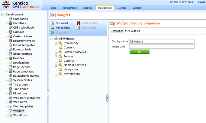
2. Widgets are grouped into categories. It is important to note that categories are used for the sake of organization only. The category under which a given widget is stored has no influence on who can use or modify the widget.
Clicking on the node the category opens and all widgets stored within that category are listed. You can also change the Display and Code name of a category. The Image path property sets the path to the image which can be used as the category icon in the Add widget dialog (the recommended size is 16x16px).
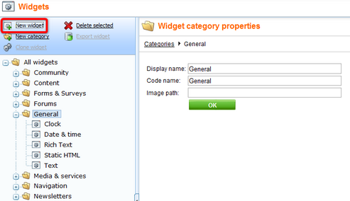
Select any category where the new widget will be stored and click the New widget ( ) icon. Alternatively, you can store the new widget into any folder and change its location later when properties of the widget will be defined.
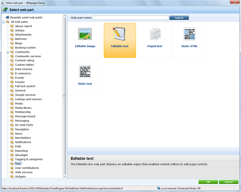
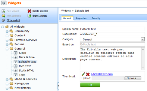
3. A dialog opens, where you can select a web part to be used as a template for the new widget. In the example below the Editable text web part from the Text folder is selected. To confirm the selection click the OK button.
4. A new widget has just been created. You can manage widgets using the icons above the tree. A new widget can be created based on an existing one using the Clone widget ( ) icon. If you are about to create a new category use the New category (
 ) icon.
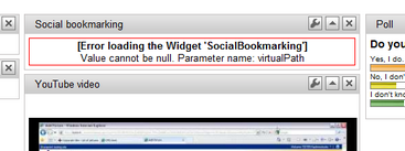
To delete a selected widget or the whole category (except the All widgets category), click the Delete selected ( ) icon. Please, bear in mind that when a widget is deleted, it is not automatically removed from page templates. Therefore, when the page containing a deleted widget is to be displayed, an error message will be displayed instead of the missing widget.
The example below shows the effect of deleting the Social bookmarking widget without removing it from the page template.
A selected widget can also be exported by clicking on the Export widget ( ) icon. For details regarding export see Exporting single objects.
5. For each selected widget there are three tabs available. On the General tab there are all the basic settings:
| • | Display name - descriptive name of the widget used in Kentico CMS user interface |
| • | Code name - name of the widget used in web site code |
| • | Category - defines to which category the widget belongs; you can change it here by selecting a new category from the drop-down list |
| • | Description - text description of the widget |
| • | Thumbnail - graphical representation of the widget in the list |
Do any changes required and click the OK button.
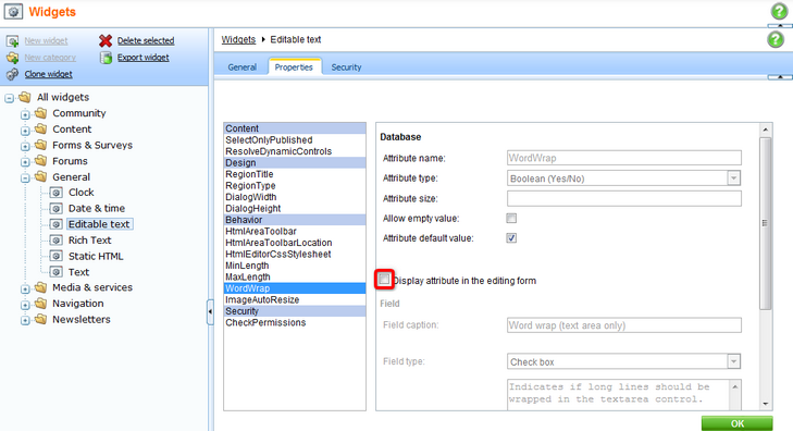
6. The Properties tab includes all the properties available for the parent web part. You can notice that all of them are disabled by default. Using the Display attribute in the editing form check box you can chose which property will be available for the widget's user. Please bear in mind that any change must be confirmed by clicking the OK button.
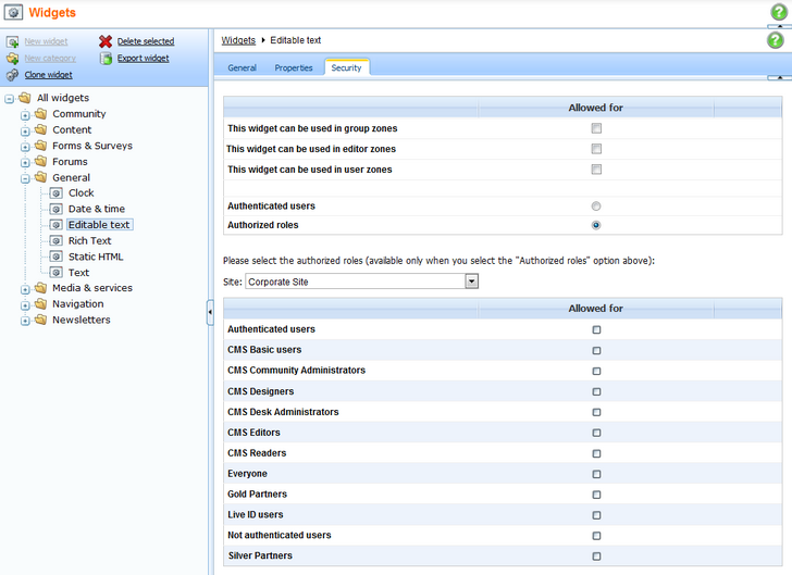
7. On the Security tab there are settings specifying where the widget can be used and who will be able to modify it. The details are given in the Widgets security section.
8. When all settings are done the widget is ready for use in a page template.
Page url: http://devnet.kentico.com/docs/devguide/index.html?developing_widgets.htm

