CMSListMenu control allows you to create a large variety of menus. It renders <UL> and <LI> tags and the design depends only on your CSS style sheet. This menu control provides several advantages:
| • | It's based only on CSS styles which makes it highly configurable. |
| • | It renders shorter HTML code than CMSMenu. |
| • | It's fully XHTML compliant. |
| • | The list-based menu is better accessible. |
| • | You can create drop-down menu using the list-based menu and CSS almost without any JavaScript. |
| • | It automatically displays standard UL/LI listing with links if the browser does not support CSS styles so that the user can still navigate on the web site. |
However, it requires advanced knowledge of CSS as it doesn't render any specific layout by itself.
It allows you to display part of the CMS content specified using its path, depth, document type and WHERE condition.
See also: Using macro expressions in menu items, Using the CSSPrefix property for design of sub-menus
Inherits: CMSMenuProperties - common properties
Properties
Property Name |
Description |
Sample Value |
DisplayHighlightedItemAsLink |
Indicates if the highlighted item should be displayed as a link. |
|
DisplayOnlySelectedPath |
Specifies whether all submenus should be displayed or just submenu under highlighted (selected) item. |
|
FirstItemCssClass |
Specifies CSS class for the first item in every menu level. |
"ListMenuFirstItem" |
HighlightAllItemsInPath |
Indicates if all items in the unfolded path should be displayed as highlighted. |
|
HighlightedNodePath |
Path of the item that will be highlighted like it was selected. The path type must be the same as PathType. If you omit this value, the control automatically uses the current alias path from the "aliaspath" querystring parameter. |
"/products/nokia" |
LastItemCssClass |
Specifies CSS class for the last item in every menu level. |
"ListMenuLastItem" |
OnMouseOutScript |
OnMouseOutScript script for menu items. You can use macro expressions here. |
"alert(this.innerText);" "alert('{%nodealiaspath%}')" |
OnMouseOverScript |
OnMouseOver script for menu items. You can use macro expressions here. |
"alert(this.innerText);" "alert('{%nodealiaspath%}')" |
RenderCssClasses |
Indicates if CSS classes should be rendered for every element. If set to false, only first and last item of menu level will use CSS class. |
|
RenderItemID |
Indicates if unique ID should be rendered for every menu item. |
|
ItemIdPrefix |
Prefix placed before each item ID. You can use it to keep ID's unique if you have several CSS list menu web parts on the same page. |
"submenu" |
HoverCSSClassName |
Name of the surrounding CSS class that is used to define styles for the hover effect if you want to render a drop-down menu. |
Horizontal |
UrlTarget |
Specifies target frame for all URLs. |
"_blank" |
RenderLinkTitle |
Specifieds if document name should be rendered as a TITLE tag of the link (for better accessibility). |
|
RenderImageAlt |
Indicates if ALT attribute should be rendered for images used in the menu (for XHTML compatibility). |
|
LoadDataAutomaticaly |
Indicates if data for the control should be loaded automatically. By default, the data is loaded automatically.
If you set this property to false, you can supply custom DataSet to the DataSource property and then call the ReloadData(false) method. |
|
RenderedHTML |
Allows you to get or set the HTML code rendered by the control.
You need to set this property before the Render event - e.g. in the OnLoad event. |
|
Methods
Method Name |
Description |
ReloadData |
Reloads the data.
If the forceLoad parameter is set to false and the custom value is assigned to the DataSource property, the properties of the CMSListMenu control are not used and only the data from the DataSource are used. |
Design
You can modify the design using the following CSS styles if the RenderCssClasses property is set to true:
Class Name |
Description |
CMSListMenuUL |
UL element style |
CMSListMenuLI |
LI element style |
CMSListMenuLink |
A element style |
CMSListMenuHighlightedLI |
LI element style of a highlighted item |
See also Using the CSSPrefix property for design of sub-menus to find out how to set different styles for particular menu levels.
Examples
Simple menu without styles
This example will show you how to display a simple menu based on the CMS content.Then, you will see how different CSS styles can render different menus.
| • | Create a new Web form. |
| • | Drag and drop the CMSListMenu control on the form. |
| • | Switch to the HTML mode and add the following line at the beginning of the page: |
| • | Set the following DOCTYPE just before the HTML element: |
<!DOCTYPE html PUBLIC "-//W3C//DTD XHTML 1.1 Strict//EN" "http://www.w3.org/TR/xhtml1/DTD/xhtml1-strict.dtd"> |
| • | Switch back to the Design mode. |
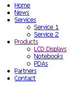
| • | Set the Path property value to /% |
| • | Run the project. You should see a UL/LI-based menu like this: |
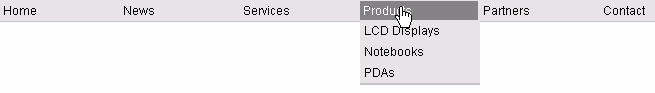
Creating a Horizontal Drop-Down Menu Using CSS Styles
Now we will modify the CSS style of the menu so that it displays a horizontal drop-down menu.
| • | Open the web page in VS.NET, in HTML mode and add the following style definition inside the <HEAD> element: |
<STYLE type="text/css" media="screen"> .Horizontal { BORDER-RIGHT: #c2c2c2 1px solid; BORDER-TOP: #c2c2c2 1px solid; FONT-SIZE: 12px; FLOAT: left; BORDER-LEFT: #c2c2c2 1px solid; WIDTH: 100%; BORDER-BOTTOM: #c2c2c2 1px solid; FONT-FAMILY: Arial; BACKGROUND-COLOR: #e2e2e2 } .Horizontal UL { PADDING-RIGHT: 0px; PADDING-LEFT: 0px; PADDING-BOTTOM: 0px; MARGIN: 0px; WIDTH: 100%; PADDING-TOP: 0px; LIST-STYLE-TYPE: none } .Horizontal LI { BORDER-RIGHT: #e2e2e2 1px solid; PADDING-RIGHT: 0px; BORDER-TOP: #e2e2e2 1px solid; DISPLAY: inline; PADDING-LEFT: 0px; FLOAT: left; PADDING-BOTTOM: 0px; BORDER-LEFT: #e2e2e2 1px solid; PADDING-TOP: 0px; BORDER-BOTTOM: #e2e2e2 1px solid } .Horizontal A { PADDING-RIGHT: 3px; DISPLAY: block; PADDING-LEFT: 3px; PADDING-BOTTOM: 2px; MARGIN: 0px; WIDTH: 112px; COLOR: black; PADDING-TOP: 2px; BACKGROUND-COLOR: #e2e2e2; TEXT-DECORATION: none } .Horizontal A:hover { BACKGROUND: #808080 no-repeat right bottom; COLOR: white } .Horizontal UL UL { Z-INDEX: 500; WIDTH: 120px; BORDER-BOTTOM: #c2c2c2 2px solid; POSITION: absolute } .Horizontal UL UL LI { CLEAR: left; DISPLAY: block; POSITION: relative } .Horizontal UL UL UL { BORDER-RIGHT: #c2c2c2 2px solid; LEFT: 100%; BORDER-BOTTOM: white 0px solid; TOP: -1px } .Horizontal UL UL { DISPLAY: none } .Horizontal UL LI:hover UL UL { DISPLAY: none } .Horizontal UL UL LI:hover UL UL { DISPLAY: none } .Horizontal UL LI:hover UL { DISPLAY: block } .Horizontal UL UL LI:hover UL { DISPLAY: block } .Horizontal UL UL UL LI:hover UL { DISPLAY: block } </STYLE> |
| • | Set the HoverCSSClassName property value to: Horizontal |
| • | Save the page and display it in the web browser. You should see a menu like this |
Creating a Vertical Drop-Down Menu Using CSS Styles
Now we will modify the CSS style of the menu so that it displays a vertical drop-down menu.
| • | Open the web page in VS.NET, in HTML mode and add the following style definition inside the <HEAD> element: |
<STYLE type="text/css" media="screen"> .Vertical { BORDER-RIGHT: #c2c2c2 1px solid; BORDER-TOP: #c2c2c2 1px solid; FONT-SIZE: 12px; BORDER-LEFT: #c2c2c2 1px solid; WIDTH: 150px; BORDER-BOTTOM: #c2c2c2 1px solid; FONT-FAMILY: Arial; BACKGROUND-COLOR: #e2e2e2 } .Vertical UL { PADDING-RIGHT: 0px; PADDING-LEFT: 0px; PADDING-BOTTOM: 0px; MARGIN: 0px; PADDING-TOP: 0px; LIST-STYLE-TYPE: none } .Vertical LI { POSITION: relative; FLOAT: left; WIDTH: 100% } .Vertical A { PADDING-RIGHT: 0px; BACKGROUND-POSITION: 0px 50%; DISPLAY: block; PADDING-LEFT: 10px; PADDING-BOTTOM: 2px; MARGIN: 0px; WIDTH: 140px; COLOR: black; PADDING-TOP: 2px; BACKGROUND-REPEAT: no-repeat; BACKGROUND-COLOR: #e2e2e2; TEXT-DECORATION: none } .Vertical A:hover { BACKGROUND: #808080 no-repeat 0px 50%; COLOR: white } .Vertical UL UL { BORDER-RIGHT: #c2c2c2 1px solid; BORDER-TOP: #c2c2c2 1px solid; Z-INDEX: 100; LEFT: 100%; BORDER-LEFT: #c2c2c2 1px solid; WIDTH: 100%; BORDER-BOTTOM: #c2c2c2 1px solid; POSITION: absolute; TOP: -1px } #Vertical1 UL { DISPLAY: none } #Vertical1 LI:hover UL UL { DISPLAY: none } #Vertical1 UL LI:hover UL UL { DISPLAY: none } #Vertical1 LI:hover UL { DISPLAY: block } #Vertical1 UL LI:hover UL { DISPLAY: block } #Vertical1 UL UL LI:hover UL { DISPLAY: block } </STYLE> |
| • | Set the HoverCSSClassName property value to: Vertical |
| • | Save the page and display it in the web browser. You should see a menu like this: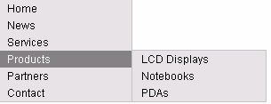 |