How to Create a Responsive Website at Speed in MVC
Nowadays, when a website isn't responsive, it's not a website. With the majority of people using their mobile devices for internet browsing, having websites optimized for mobile has quickly become very important. Have you implemented a responsive website on Portal Engine before? What would change for you in MVC?
What Is a Responsive Website?
Let's start with the basics. When you open your browser and access a website like Google.com, it shows you the same content regardless of which device you use - computer, mobile phone, tablet, Kindle, it all shows just a single search box. However, if you open a website that contains a lot of content, like CNN, on every device you will see a different layout. On a desktop I see three columns with news articles, while on mobile there is just one column and articles are stacked vertically.
If a website is capable of reorganizing its layout in a way that displays the same content on all devices, it's a responsive website. The goal is to ensure a great experience for everyone regardless of which device they use to consume the content.
How Is the Website Doing It?
Every website has a stylesheet that defines how the components render, e.g., which image is on the background and which font should be used for texts. The stylesheet can also contain rules to switch styles based on defined criteria. Those include browser width, media type, like print, and others.
body { background: green; }

@media print {
 body { background: white; }
}

@media screen and (max-width: 600px) {
 body { background: black; }
}
The example above ensures that a background of a page is green unless you want to print it. Then the background will turn white. Also, if your screen has less than 601px in width, the background will be black.
This is essentially how responsiveness works on websites - every switch or alternative layout is defined using media queries. At this point it's good to remember two rules of thumb:
- When starting to design a new responsive site, start with mobile and continue with tablet and desktop. It's easier than going the other way around.
- Do not hide any information using media queries. It's tempting to hide "less important" content to save room for other elements. However, your visitors with mobile phones will be frustrated as they won't be able to reach it. Especially when they know the content is available on larger screens.
Obviously, you don't need to spend days and weeks on fine-tuning your stylesheets. There are many frameworks that do this job very well for you and you can focus on the actual layout definition. In the past, I used to work with Bootstrap and Pure.css, but there are many others. Check out this list of top 5 responsive frameworks.
Building a Responsive Website in Kentico
If I had a dollar for every time I got asked about building a responsive site in Kentico, I'd be a millionaire. Portal Engine provides many ready-to-use components, so web development is rapid, however customizing the HTML output can be challenging for some.
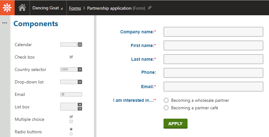
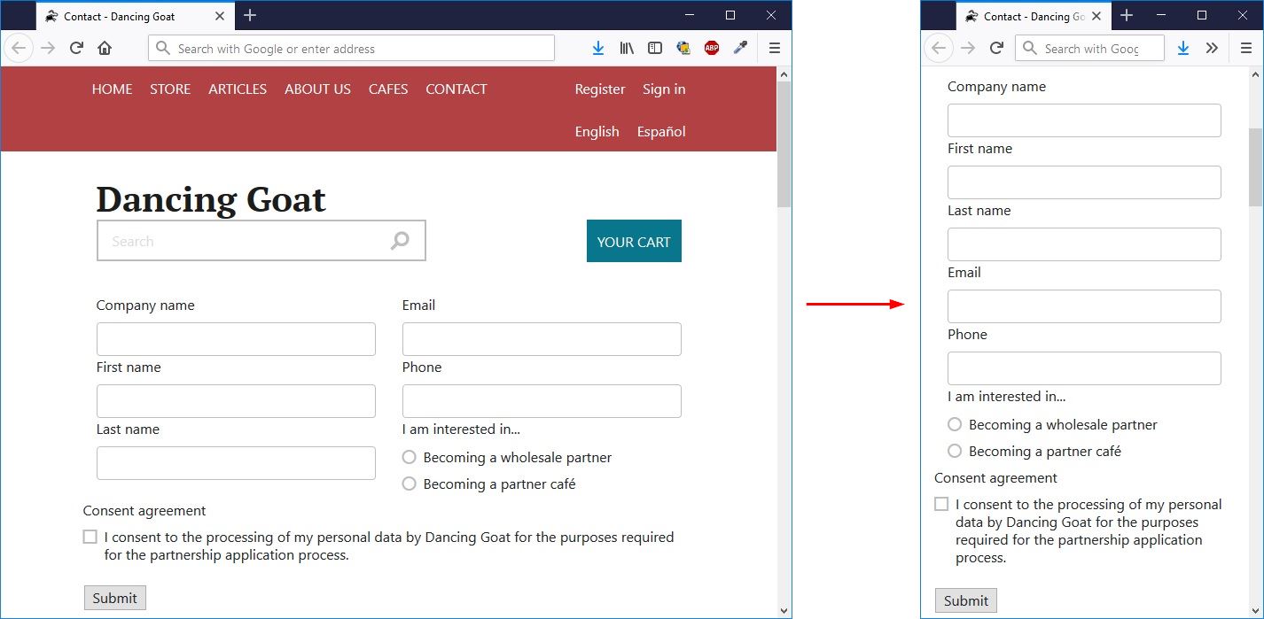
Let's take forms as a nice example. When your editors needed to create a form using Portal Engine, they typically designed it in the Form Builder application and did not care about the HTML representation on the live site. It was the job of developers to make it look and behave nicely.
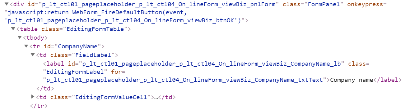
The layout was fixed in the implementation of the Form web part, and you had to adjust your stylesheets to achieve nice appearance. If the site responsiveness required some HTML changes, you were left with Web Part Containers (or HTML before/after fields). Many clients went the other way and defined the layout using an Alternative form. That worked for rather static forms as in case of any change in the field set the Alternative form had to be updated too. The Form web part also became a bit useless as it only displayed the HTML code you defined.
The Right HTML Structure with MVC
If you needed to display the fields among multiple columns, Alternative forms became the only possibility. And here we talk about responsiveness - sometimes we want to display the form fields in multiple columns on larger screens and a single column on mobile.
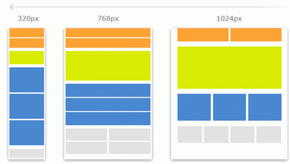
Image credit: https://www.apexdigital.co.nz/blog/the-what-how-and-why-of-responsive-website-design/
Let's take a look now how MVC makes things much easier for us developers. The form builder now features sections which enable better organization of elements by editors. Take a look at the same form as above, but defined with sections.
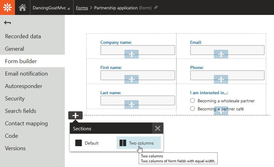
These two sections come out of the box, but you can add custom sections that correspond with your design. Editors can design their form nicely for large screens, but you still have complete freedom over the output HTML.
To show you how easy this is, I aimed to create two columns layout with one additional row below them for consent agreement. To register a new form section, you need to create and register its Controller. It only defines which view (output HTML) to use and what labels Kentico should show in the administration interface.
[assembly: RegisterFormSection("KenticoCommunity.FormSections.TwoColumnsOneRow", typeof(TwoColumnsOneRowFormSectionController), "Two columns + one row", Description = "Organizes fields into two equal-width columns side-by-side and one row below them. Fully responsive.", IconClass = "icon-l-header-cols-2-footer")]
namespace KenticoCommunity.FormSections
{
   public class TwoColumnsOneRowFormSectionController : Controller
   {
       public ActionResult Index()
       {
           return PartialView("FormSections/_TwoColumnsOneRowFormSection");
       }
   }
}
The partial view is where the HTML is defined:
@using Kentico.Forms.Web.Mvc
@using Kentico.Web.Mvc

<div class="container">
   <div class="row">
       <div class="col-sm">
           @Html.Kentico().FormZone()
       </div>
       <div class="col-sm">
           @Html.Kentico().FormZone()
       </div>
   </div>
   <div class="row">
       @Html.Kentico().FormZone()
   </div>
</div>
I used Bootstrap to define the responsiveness of the columns. Visitors with screens over 768px in width will see two columns and two rows. Smaller screens will display the columns as full-width rows resulting in three rows in total.
To display the form on the live site, I used the Form MVC widget which comes out of the box. The process of adjusting the form layout is simple and straightforward. In case you need to adjust the HTML output of specific fields, you can use field attributes right in the Form builder or implement custom form controls. The process is almost the same as with sections - create a code file, implement the logic, and prepare a view. Take a look in the documentation for specific steps.
Responsiveness, Accessibility and Other Web Standards
For all these components, it's much easier to implement them in MVC. Widgets, form sections, form controls, and others follow the same pattern - model » controller » view. The output HTML of each of these components is stored in a contextual partial view, so it's easy to adjust it to match your requirements. And that's not just about responsiveness. Nowadays, many websites need to comply with accessibility standards, need to include microdata, or be well optimized for search engines. That's why having full control over the output HTML is a must.
I know it's an end of an era and we've all spent a lot of time with WebForms, but it's time for a change. If you're feeling a bit nostalgic, here is a present for you: print this out and hang it above your monitor. And when you're done, jump into MVC and let me know how you find it!