Available web parts |

|

|

|

|
|
Available web parts |

|

|

|

|
|
|
||
There are three web parts suitable for creating image galleries. From the Select web part dialog window, you can select the Image gallery, Lightbox gallery and Content slider web parts in the Listings and viewers category.
This is the basic web part for image galleries. In its initial view, it displays a set of picture thumbnails:
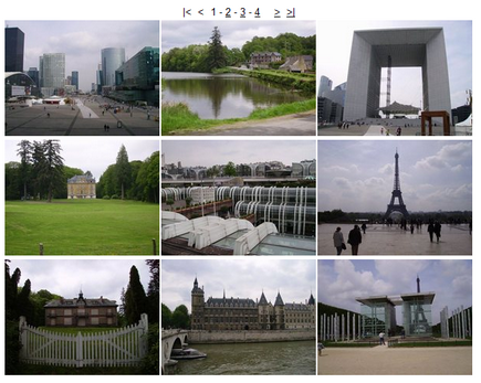
After clicking one of the thumbnails, the detail view will be displayed:
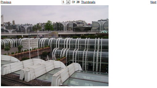
Besides the usual parameters common to all web parts, these properties can be set to customize the appearance of the gallery:
Transformations |
|
Detail transformation |
Transformation used for displaying a selected image. |
Thumbnail transformation |
Transformation used for displaying gallery thumbnails. |
Layout |
|
Number of columns |
Number of thumbnail columns in the thumbnail view. |
Rows per page |
Number of thumbnail rows per page in the thumbnail view. |
Repeat direction |
Determines the direction in which items should be displayed when multiple columns are used - can be either vertical or horizontal. |
Paging |
|
Paging mode |
Paging parameter transfer type: Query string - the paging parameter is transferred through URL Postback - the actual page is transferred through ViewState, no URL parameter is used |
Query string key |
Name of the URL parameter containing the page number. |
Show first and last buttons |
If checked, buttons leading to the first and last pages of the gallery will be displayed. |
Show buttons on top |
If checked, paging buttons will be shown above the thumbnails. Otherwise, they will be displayed below them. |
This web part's thumbnail view is similar to that of the Image gallery web part:
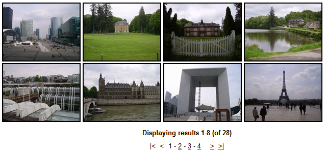
After clicking one of the thumbnails, the whole page will be grayed out and a lightbox with the selected image will be displayed on the top of it, as you can see in the screenshot below:
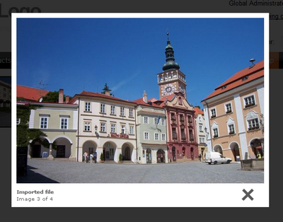
Here is a list of properties specific to the Lightbox gallery web part:
Transformations |
|
Transformation |
Transformation used for displaying the list of thumbnails. |
Alternating transformation |
Transformation used for even items in the thumbnail view. |
Selected item transformation |
Transformation used in the detail view mode. |
Item separator |
Separator displayed between thumbnails. |
Nested controls ID |
Sets the nested controls IDs. Use ';' as a separator; Example: myRepeaterID;myDatalistID;myRepeaterID2
This property replaces the previously used NestedRepeaterID and NestedDataListID properties. If you are still using these properties, no changes to functionality will occur, but it is advisable to rewrite your code to use the new property instead. |
Paging |
|
Enable paging |
Indicates if paging is enabled. If unchecked, all thumbnails in the gallery will be displayed on a single page. |
Paging mode |
Paging parameter transfer type: Query string - the paging parameter is transferred through URL Postback - the actual page is transferred through ViewState, no URL parameter is used |
Pager position |
Determines position of the pager. Available options are Bottom, Top and Top and bottom. |
Page size |
Number of thumbnails displayed per page. |
Query string key |
Name of the URL parameter containing the page number. |
Show first and last buttons |
If checked, buttons leading to the first and last page of the gallery will be displayed. |
LightBox Configuration |
|
Always visible navigation buttons |
Indicates whether the navigation buttons are always visible, not only on mouse over. |
Frame width |
Width of the LightBox frame. |
Frame height |
Height of the LightBox frame. |
Path to external CSS file |
URL path to the external CSS file required by LightBox. |
Overlay opacity |
Opacity of LightBox background. Enter values ranging from 0 (transparent) to 1 (opaque black). |
Animate |
Enables LightBox animation. |
Load delay |
Load delay time (in miliseconds). If you are using automatic resizing, this value indicates how long the lightbox will take to reach the element size. If you have problems with displaying lightbox content, try to use a higher value. |
Resize speed |
Defines the speed of resizing images. Choose values ranging from 1 (slowest) to 10 (fastest). |
Border size |
Size of the image border. |
Loading image |
Image displayed while loading the LightBox image. |
Close button image |
Image of the Close button. |
Previous button image |
Image of the Previous button. |
Next button image |
Image of the Next button. |
Group name |
Name of the LightBox group. |
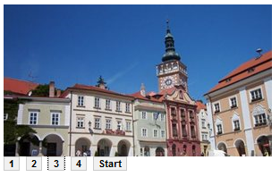
The Content slider is a web part that can be used for displaying various document types, hence it is also very suitable for displaying images. Contrary to the previous two web parts, the Content slider provides no thumbnail view. It displays a full sized image slide show with a pager below. The pager allows for browsing through the images using the numbered buttons. After clicking any of these buttons, the slide show stops and the Start button appears. This button launches the slide show again.
Specific properties of the Content slider web part:
Transformations |
|
Transformation |
Transformation used for displaying the list of thumbnails. |
Alternating transformation |
Transformation used for even items in the thumbnail view. |
Item separator |
Separator displayed between thumbnails. |
Nested controls ID |
Sets the IDs of nested controls as specified in the transformation code. |
Div options |
|
Width (px) |
Width of the scrolling text area in pixels. |
Height (px) |
Height of the scrolling text area in pixels. |
Style |
Style assigned to the DIV tag of the area. |
JavaScript options |
|
FadeIn time (milliseconds) |
Fade in time of the image. |
FadeOut time (milliseconds) |
Fade out time of the image. |
Break time (milliseconds) |
Time for which the image will be displayed. |
Auto start |
If checked, the slide show will automatically start from the beginning. |