|
|

Assigning form controls to fields |

|

|

|

|
|
Assigning form controls to fields |
|
|

|
|
|
|
Assigning form controls to fields |
|
|
|
|
|
Assigning form controls to fields |
|
|
|
|
|
|
||
To allow users to interact with the fields in an editing form, it is necessary to select an appropriate form control for each displayed field. This can be done through the field editor of the given form, specifically using the Form control property in the Field appearance section.
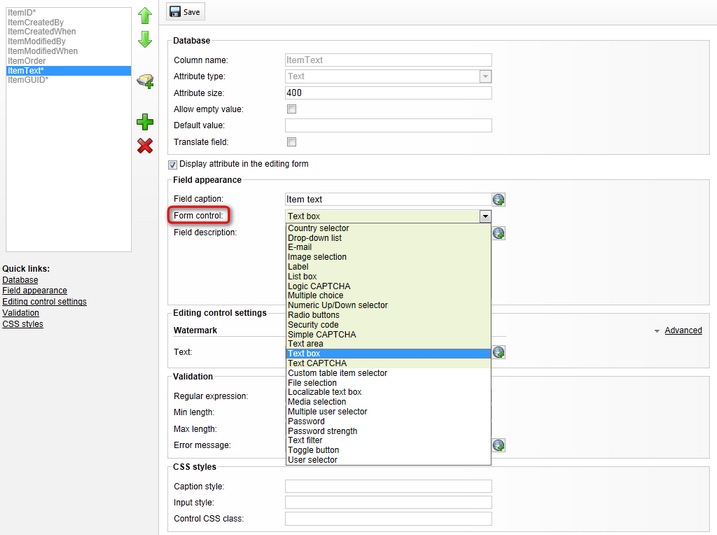
As you can see, the high priority form controls are highlighted and offered first in the selection list. If there are too many form control options and you cannot find the one that you need directly in the drop-down, you can assign it via the full selection dialog opened by clicking the (more items ...) option.
Please keep in mind that the selection options are limited by the scope settings of individual form controls. This means that different controls will be offered based on the type of form that is being edited and the Attribute type selected for the current field.
|
Default form control selection
You can use the settings in Site Manager -> Settings -> System -> Form engine to choose which form controls should be offered as the default option when adding new fields in the field editor. A separate setting is available for each data type (Attribute type) that can be assigned to a field.
These settings are global and affect all sites in the system. |
In addition to the choice of a form control, the field editor provides many configuration options for individual fields as described in the table below. Please note that not all settings may be available depending on the selected Attribute type and the field editor may also have other options related to the specific object type for which the form is being defined.
Database |
|
Column name |
Sets the name used for the database column storing the values of the field. It also serves as an identifier for the field. |
Attribute type |
Determines the data type of the value that the field will contain. |
Attribute size |
Sets the maximum amount of characters that can be entered into the field. Only available if the Attribute type is set to Text. |
Allow empty value |
If enabled, the field will allow empty values. If disabled, it will not be possible to save the form unless there is a value entered in the given field. |
Default value |
The default value of the field that will be pre-filled when the form is loaded. |
Translate field |
Indicates if the field should be included when using translation services with the objects for which the form is defined.
Only available if the selected Attribute type is Text or Long text. |
Display attribute in the editing form |
Indicates if the given field should be shown in the form to users. This can be disabled for fields that store internal or system values. |
Field appearance |
|
Field caption |
Sets the text displayed in the editing form next to the field. |
Form control |
As described in the text above, this field selects the form control that will be used to interact with the given field in the editing form. |
Field description |
Tooltip which will be displayed if a user hovers over the field. |
Editing control settings |
|
The settings in this section provide a way to configure the parameters defined for the selected Form control. Please see the Form control parameters topic to learn more. |
|
Validation |
|
Regular expression |
This regular expression will be used by the field's validator to determine which values are acceptable. Only available if the selected Attribute type is Text or Long text. |
Min/Max length |
Sets the minimum/maximum length for entered values. Only available if the selected Attribute type is Text or Long text. |
Min/Max value |
Sets the minimum/maximum value that can be entered. Only available if the selected Attribute type is numerical. |
From/To |
Can be used to specify a time interval into which the entered value must belong. Only available if the selected Attribute type is Date and time. |
Error message |
Error message displayed if a user enters invalid input into the field and attempts to save the editing form. |
CSS styles |
|
Caption style |
Used to set CSS styles for the caption of the given field. |
Input style |
Used to set CSS styles for the input entered into the field. |
Control CSS class |
Name of the CSS class used to style the field. |
Field advanced settings |
|
Visible condition |
May be used to enter a macro condition that must be fulfilled in order for the specific field to be visible in the editing form. The condition is dynamically resolved when the form is loaded.
You can write any condition according to your specific requirements. For details about available macro options and syntax, please refer to the Development -> Macro expressions chapter of the Developer's Guide.
If you wish to create a condition that depends on the state of the other fields in the form, you can access them in the macro expression using the corresponding Column name. The data of the fields may then be retrieved through the following properties:
•Value - returns the current value of the field. For example, FirstName.Value is resolved into the value entered into the FirstName field. •Visible - returns a true value if the given field is currently visible in the form. •Enabled - true if the field is currently enabled, i.e. its value can be edited. •Info.<field setting> - may be used to access various settings configured for the field, for example: FirstName.Info.AllowEmpty |
Enabled condition |
Allows you to enter a macro condition that determines when the field should be enabled. If this condition is resolved as false, the field will be visible, but it will not be possible to edit its value.
You can use the same macro options as described above for the Visible condition property. |
Has depending fields |
If enabled, the editing form will be refreshed via autopostback whenever the value of the given field is changed. This means that other fields can be dynamically updated according to the current value of the field.
Please note that the actual logic of the dependencies needs to be implemented in the code of the used form controls. |
Depends on another field |
This option must be enabled if you wish to have the behavior of the field dynamically changed according to the value of some other field. |
Forms may also contain categories, which allow you to group multiple fields together. Using categories is recommended in large forms to make orientation easier for users. Each category will include those fields that are positioned below it in the field editor. Categories can be created by clicking the New category ( ) button.
The following settings are available when creating or editing a category:
Category |
|
Category name |
Sets the name of the category that will be displayed in the editing form. |
Collapsible |
If enabled, users will be able to collapse and expand the content of the category. |
Collapsed by default |
If enabled, the category will initially be collapsed when the form is loaded. |
Visible |
If disabled, the category and all of the fields it contains will be hidden in the form. |
Visible condition |
May be used to enter a macro condition that must be fulfilled in order for the category to be visible. You can use the same macro options as described above for the Visible condition property of fields. |
