|
|

Developing sites for mobile devices |

|

|

|

|
|
Developing sites for mobile devices |
|
|

|
|
|
|
Developing sites for mobile devices |
|
|
|
|
|
Developing sites for mobile devices |
|
|
|
|
|
|
||
Kentico CMS allows you to create a dedicated website section where users accessing the site from mobile devices will be redirected.
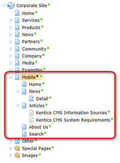
An example of such a website section can be found on the sample Corporate Site, under the /Mobile node. The Mobile page works as a master page for the mobile section. It has no template inheritance configured so that it doesn’t inherit from the site’s main master page. Under it, you can find the following sections:
•Home – this is the page where the mobile user gets redirected from the site’s main Home page. In the top part of the page, there are two Editable text web parts with some explanatory text. Below them, content is loaded dynamically from the Editable text web part on the main Home page by the Repeater web part with title Home page repeater.
•News – contains a Repeater web part displaying the News documents stored under /News. Its transformation is written so that when you click a news item’s title, you get redirected to the /Mobile/News/Detail page with the ID of the news item in the wildcard part of the URL (/Mobile/News/{id}).
•Articles – the Repeater web part on this page displays the articles stored under it. The content of this section is separate, i.e. it is not shared with the rest of the site and is used only in the mobile section.
•About us – contains only two Editable text web parts and its content is separate and used only in the mobile section.
•Search - this page is not accessible through navigation. Users are redirected here when they search within the mobile section. Search results are displayed here to them by the Smart search results web part.
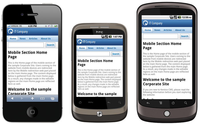
The figures below show what the mobile section looks like when viewed on different mobile devices:
There is a dedicated CSS stylesheet - Corporate Site – Mobile - which is used only by the pages in the mobile section. While the site’s main stylesheet is Corporate Site, the mobile section's master page has the Corporate Site – Mobile stylesheet assigned in Properties -> General -> CSS stylesheet. All pages under it inherit this configuration and use the same stylesheet as the master page.
Recognition of mobile devices is ensured by the Mobile device redirection web part placed on the main Home page of the website. Site visitors accessing the site’s main Home page from a mobile device get recognized by the web part and get redirected to one of the two URLs specified by its Small device redirection URL and Large device redirection URL properties. In this case, both large and small devices get redirected to ~/Mobile/Home.aspx.
Choice of one of the two URLs is performed based on detection of the device's user agent and can be configured by means of web part properties:
Small device redirection URL |
URL to which mobile devices recognized as small should be redirected. The properties below can be used to configure small/large device recognition. |
Large device redirection URL |
URL to which mobile devices recognized as large should be redirected. The properties below can be used to configure small/large device recognition. |
Redirect Android |
Determines if Android mobile devices should be recognized as small or large devices. If set to Automatic, they will be recognized as small. If set to Never, they will never be redirected. |
Redirect BlackBerry |
Determines if BlackBerry mobile devices should be recognized as small or large devices. If set to Automatic, they will be recognized as small. If set to Never, they will never be redirected. |
Redirect iPad |
Determines if iPad devices should be recognized as small or large devices. If set to Automatic, they will be recognized as large. If set to Never, they will never be redirected. |
Redirect iPhone |
Determines if iPhone devices should be recognized as small or large devices. If set to Automatic, they will be recognized as small. If set to Never, they will never be redirected. |
Redirect Nokia |
Determines if Nokia mobile devices should be recognized as small or large devices. If set to Automatic, they will be recognized as small. If set to Never, they will never be redirected. |
Always redirect |
On first access from a mobile device, a redirection cookie is stored in the device's browser. If this option is disabled, the device is not redirected if the cookie is present in its browser, i.e. it is only redirected for the first time. If enabled, devices are redirected on each access. |
Other small devices (User agent) |
List of additional user agents which should be recognized as small mobile devices. Multiple user agents can be entered, each on a separate line. |
Other large devices (User agent) |
List of additional user agents which should be recognized as large mobile devices. Multiple user agents can be entered, each on a separate line. |