Responsive images
In this article we will learn how modern browsers work with responsive images.
When you create new sites, you usually make them responsive to adapt to different screens and devices. You also want to offer different images (i.e. different sizes and resolutions) according to a resolution of target screen. This is all described here.
There are currently two ways to approach responsive images on your site using HTML specifications, alone:
- picture and source elements
- srcset attributes of an img element
The picture element allows you to decide what image to render based on the media query. Alternatively, the srcset attribute of the img element provides information to a browser to help it decide which image to render.
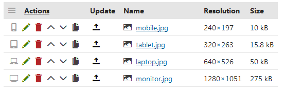
For your convenience, I have implemented a form control that helps you with responsive images on your site. The Responsive images form control can store up to 4 sizes or versions of an image (S, M, L, XL) for different devices (mobile phone, tablet, laptop, hi-resolution monitor) and you can download it here. The form control is not fully tested for all scenarios.
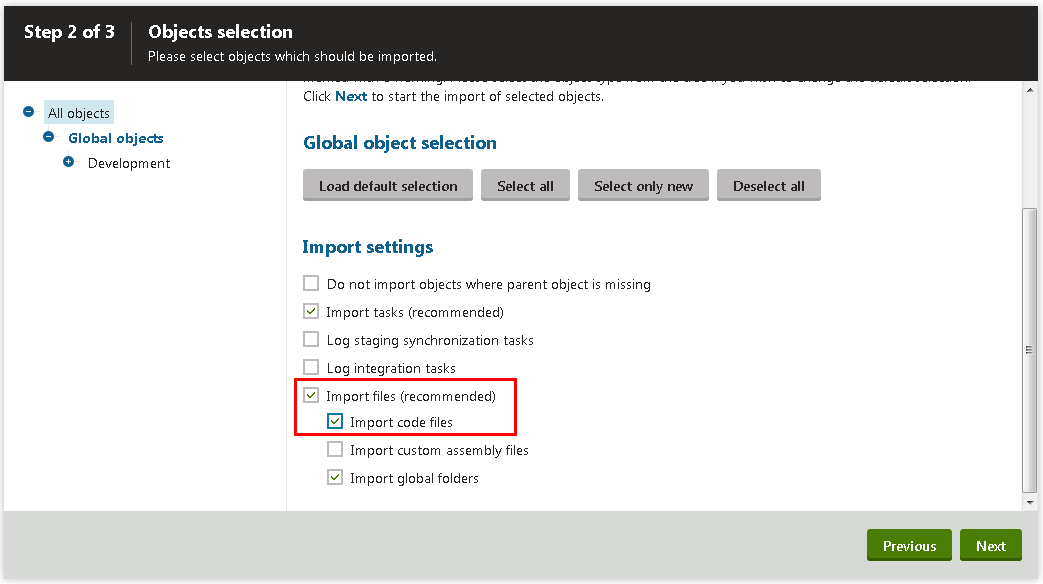
Import the downloaded package to your Kentico 9.0.5 hotfix or newer and do not forget to check the Import code files checkbox in Step 2 of the importing process.
Once the package is imported, you can start to use the form control; it can take a while to load since the site needs to be recompiled.
The usage of the form control depends on your scenarios, here are two common usages:
1) You want to have a background or header image to be responsive. This is usually one image linked within a page, so you can extend the Page type by adding a text field and assign the Responsive images form control to it. Now you can upload up to 4 versions of an image to your page (i.e. resized versions of one image, entirely different images or cropped versions of an image).
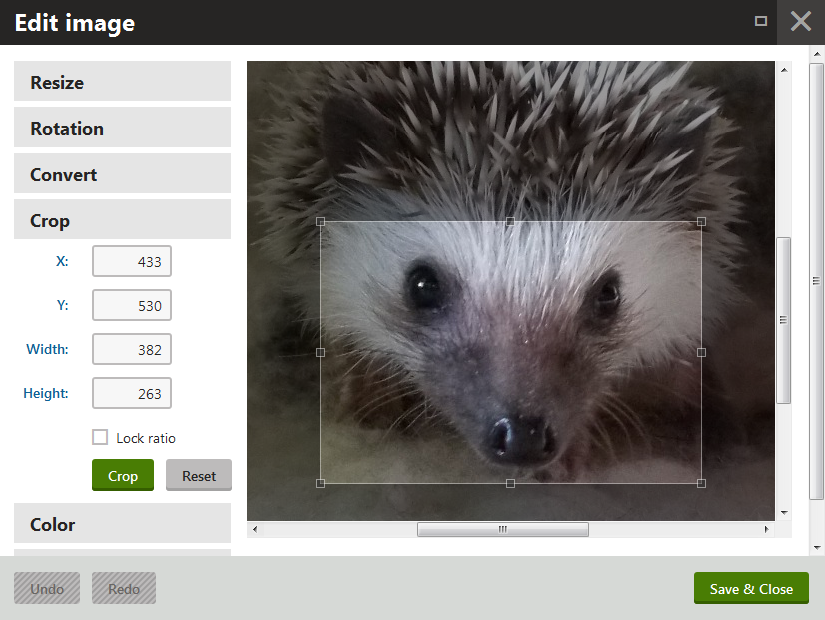
You can also upload just one image (original size) and use the built-in image editor and cloning feature to create all other versions:
With all the images uploaded, you can build the markup of a responsive image using any web part that allows you to add HTML code, such as Static text web part, or you can put it directly into the layout of your page template:
a) Picture element
<picture>
  <source srcset='{%GetResponsiveImageUrl(DocumentID,ResponsiveImagesField,"S")%}' media="(max-width: 400px)" />
  <source srcset='{%GetResponsiveImageUrl(DocumentID,ResponsiveImagesField,"M")%}' media="(max-width: 640px)" />
  <source srcset='{%GetResponsiveImageUrl(DocumentID,ResponsiveImagesField,"L")%}' media="(max-width: 1280px)" />
  <source srcset='{%GetResponsiveImageUrl(DocumentID,ResponsiveImagesField,"XL")%}'>
  <img src='{%GetResponsiveImageUrl(DocumentID,ResponsiveImagesField,"XL")%}' alt="some image" />
</picture>
b) Srcset in img element:
<img
src='{%GetResponsiveImageUrl(DocumentID,ResponsiveImagesField,"XL")%}'
srcset='{%GetResponsiveImageUrl(DocumentID,ResponsiveImagesField,"XL")%} 1280w,
{%GetResponsiveImageUrl(DocumentID,ResponsiveImagesField,"L")%} 720w,
{%GetResponsiveImageUrl(DocumentID,ResponsiveImagesField,"M")%} 540w,
{%GetResponsiveImageUrl(DocumentID,ResponsiveImagesField,"S")%} 380w'
>
As you can see, there is a macro method used for generating a URL of a given image version where parameters are as follows: first, is the DocumentID, second is the name of your Responsive images field and third specifies the version of the image you want to display.
2) You want to display multiple responsive images on your page. In this scenario, I suggest creating a new page type called Responsive image that would contain one Responsive images field. Ideally, you would place one page under the current node for each image you want to be responsive. On the parent page, you would add a Repeater web part; the great advantage here is that you can use the same code from the previous option since the DocumentID is in the context of a transformation. This means the DocumentID of the document currently listed in the repeater is used instead of the DocumentID of the page that the repeater is placed on. Because of this, you can put the mentioned markup into a transformation and let the repeater list all of your Responsive image pages.
I hope this article provided enough information to start playing with responsive images in your Kentico sites.