Contextual help in Kentico 8
Improving the learnability of Kentico was one of our top priorities for this release. We had to tackle the issue on several levels. The application had to be more intuitive, users needed an easier way of getting help and the documentation had to be actionably helpful. The new contextual help is our solution.
Previously on the Kentico 8 redesign
Last time, we went through various ways the new navigation in Kentico 8 works. Today, I will introduce the reworked system of contextual help, which plays a major role in improving the learnability of Kentico.
Learning and documentation
The Kentico learning curve was too long. This was number three in our
list of top issues with user experience of Kentico. Not only did we hear this a lot during our interviews and field observations, but the time and effort our partners put into the training process of each client gave us some serious hard data.
A big part of the problem was the complicated UI, which hindered learning by requiring the users’ to memorize where they were supposed to click. The less tech-savvy people struggled to understand the terminology. And although the documentation was extensive, when users did manage to find it, it was not easy to locate answers to simple questions like “How do I add a new widget?”.
?
Do you remember those little question mark icons that were at the top right-hand corner of each frame? We were quite surprised to find out that about 90% of interviewed users never noticed them. The user interface was so cluttered that most people developed a serious case of “Banner blindness” and simply ignored the parts of UI they did not have to use.
The solution to these issues has two levels, design and content.
Content level
The most important part of any documentation is the content. The way information is structured and written determines whether the help is actually helpful. Therefore the documentation in Kentico 8 has been almost completely rewritten. It is now much more task-oriented and considers factors like who needs the content, what they are trying to accomplish, etc. The results of our efforts are step-by-step guides that provide users with a list of easy-to-follow steps to finish the task.
The documentation is now completely online and the system allows anybody to comment on articles, which can then be easily updated by our Technical writers. Feel free to tell us what is missing and it will be added.
Design level
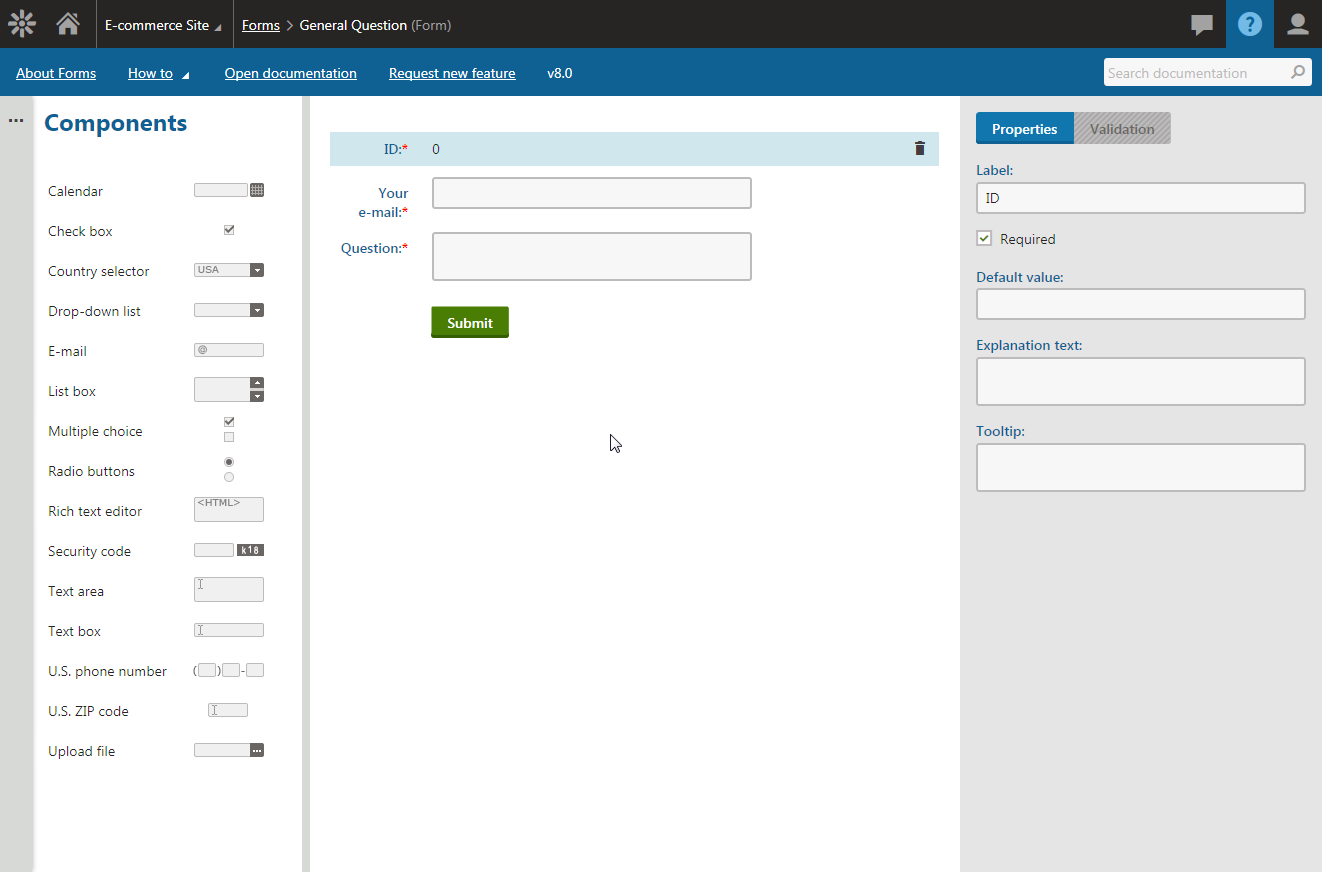
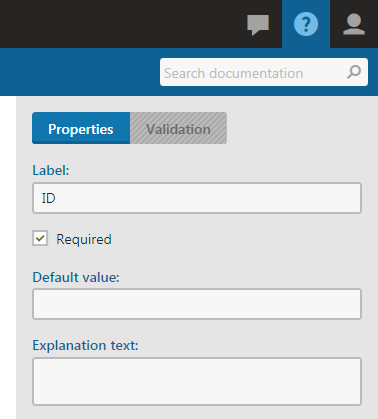
To help people actually notice the documentation, all the small question marks throughout Kentico were removed and replaced with just one icon, which now sits in the right-hand side of the header. When you click this icon, or when you press the F1 key, our new contextual help toolbar appears.

It is persistent, so you can have it open for ever-handy help while continuing to use Kentico. It is also contextual, so the toolbar content changes according to which application you are currently in, showing you the most relevant topics first. All the links automatically open in a new browser tab, so you can easily switch back and forth between application and documentation.
The first option in the toolbar is “About [current application]” which offers a brief description of the app and relevant links you might want to check out.
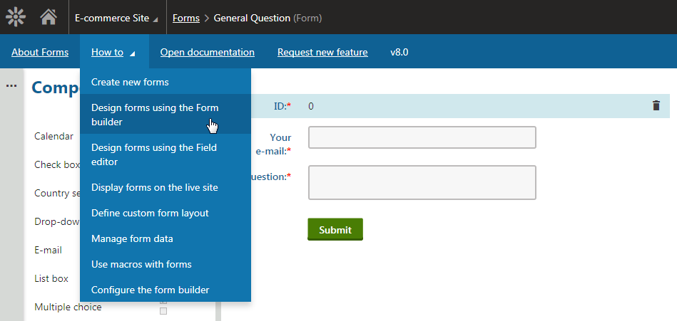
Then there is a “How to” drop-down menu, which contains a list of the most important step-by-step guides, again related to the selected application.

Should you want to browse the full documentation, the “Open documentation” link takes you to the root of Kentico documentation.
The “Request new feature” link allows you to tell the Kentico product management team what you would like to see added to the product.
And, last but not least, the search field on the right-hand side of the toolbar allows you to search the documentation directly, with results opening in new browser tab.

Find out more about Kentico redesign
This article is part of a series explaining how and why we redesigned the user interface in Kentico 8. Check out the rest of the articles from this series:
-
Introduction to Kentico 8 Redesign
-
New Application Structure
-
Navigation
-
Contextual help
-
Behind new look and feel
-
Graphic principles of new UI
-
Design system and evaluation process of new UI
-
Updating iconography
-
Execution timeline