Introducing JQuery Mobile
Using HTML and CSS to build a mobile oriented user interface is one of the more powerful features of HTML 5. Unfortunately, because of the complexity it may take some time to build even a simple user interface. This is where a web development framework like JQuery mobile can help to get the job done. This type of mobile framework is a packaged collection of interactive elements and code tools. In this blog post well take a look at why we would want to use a mobile framework like JQuery mobile and then build a simple application to illustrate the power of these types of frameworks.
A mobile framework involves a combination of Javascript, CSS and other assets that aid in the styling of the mobile experience. There are many different frameworks available and its important to choose the one that makes sense for your project. JQuery mobile is one of the fantastic HTML 5 based user interface mobile frameworks available. For developers it leverages JQuery and the JQuery UI foundations and it helps to make mobile applications feel usable quickly.
 What other mobile frameworks are available?
There are many different frameworks available. I found what looks to be a very nice and complete comparison chart available here.
A couple of things I would recommend you keep in mind when deciding or using a mobile framework.
A framework can help to manage cross platform inconsistencies Framework developers keep on top of the multitude of browser quirks that can occur and make your applications behave poorly or inconsistent and provide a way to work around these in their codebase.
A framework can help to make a website or application look mobile friendly Mobile oriented frameworks generally help to alter and style HTML elements to look and feel more mobile, often saving time.
A framework can help make a website or application feel mobile Frameworks can take the drudgery out of transitions and effects that make a website or application feel more native, or at least consistent.
Mobile frameworks provide quite a bit of power and can definitely help to simplify the development process. Its not all a panacea and making a careful, informed choice is important. For example, a mobile framework may increase the size of your application or even cause performance issues. Remember choose carefully and test often. Make sure to use the features that make sense and youre not seeing any performance issues.
Getting Started with JQuery Mobile
While there are many different frameworks available I am a fan of JQuery Mobile and how nicely its architecture maps to HTML5. Also, that it contains what looks to be a pretty complete set of documentation. A good place to start is the Getting Started section available here. The following code is an HTML file I adapted for a simple illustrative Kentico CMS application using JQuery Mobile.
<!DOCTYPE html>

<html>

<head>

<title>My Page</title>

<meta name="viewport" content="width=device-width, initial-scale=1">

<link rel="stylesheet" href="http://code.jquery.com/mobile/1.2.0/jquery.mobile-1.2.0.min.css" />

<script src="http://code.jquery.com/jquery-1.8.2.min.js"></script>

<script src="http://code.jquery.com/mobile/1.2.0/jquery.mobile-1.2.0.min.js"></script>

</head>

<body>

<div data-role="page">

<div data-role="header">

<h1>Welcome to Kentico CMS</h1>

</div><!-- /header -->

<div data-role="content">

<p>Kentico CMS is one of the most powerful Customer Experience Management Systems and Content Management Systems on the planet. With over 15,000 web sites in 87 countries it is used for everything from simple web sites to complex applications. Kentico CMS is easy to install, simple to manage and reliable.</p>

</div><!-- /content -->

<div data-role="footer">

<h4> Get Kentico CMS</h4>

</div><!-- /footer-->

</div>

</div><!-- /page -->

</body>

</html>
Here's what's in the template. In the head, a meta-viewport tag sets the screen width to the pixel width of the device and references to jQuery, jQuery Mobile and the mobile theme stylesheet from the CDN add all the styles and scripts. J
In the body, a div with a data-role of page is the wrapper used to delineate a page, and the header bar (data-role="header") and content region (data-role="content") are added inside to create a basic page. These data- attributes are HTML5 attributes used throughout jQuery Mobile to transform basic mark-up into an enhanced and styled widget. Inside your content container; you can add any standard HTML elements like headings, lists, or paragraphs. Also, you can write your own custom styles for custom layouts by adding an additional style sheet to the head after the jQuery Mobile stylesheet.
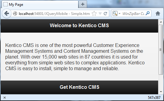
Lets go ahead and start the page as shown in the following screenshot.
Its responsive?
Go ahead and change the screen size and see happens! Download the file here.
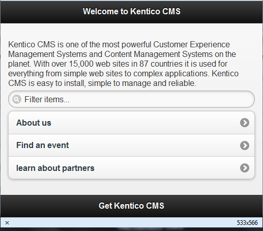
jQuery Mobile includes a set of common listviews that are coded as lists with a data-role="listview" added. Here is a simple linked list that has a role of listview. We'll make this look inset by adding a data-inset="true" and add a dynamic search filter with the data-filter="true" attributes.
<ul data-role="listview" data-inset="true" data-filter="true">

<li><a href="#"> About us</a></li>

<li><a href="#"> Find an event</a></li>

<li><a href="#">learn about partners</a></li>

</ul>
When the application is run we can see it as shown in the following screenshot.
I want the code?
The code is available from here.
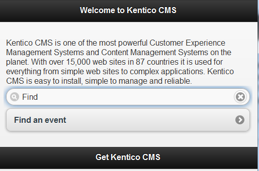
Lets type Find into the search bar as shown in the following screenshot.
While these are very simple examples and only scratched the surface I would definitely recommend taking a look at what JQuery mobile can do.